

Project Overview
Brooklyn Brainery offers affordable educational classes covering a wide range of topics and skill levels, and emphasizes connection to their community and users.
Why redesign Brooklyn Brainery’s website? We wanted to redesign the website so that it feels as connected and approachable as the business does.
Over two rounds of research and testing, we considered how the navigation could be redesigned in order to improve the usability of the website.
Methods Employed
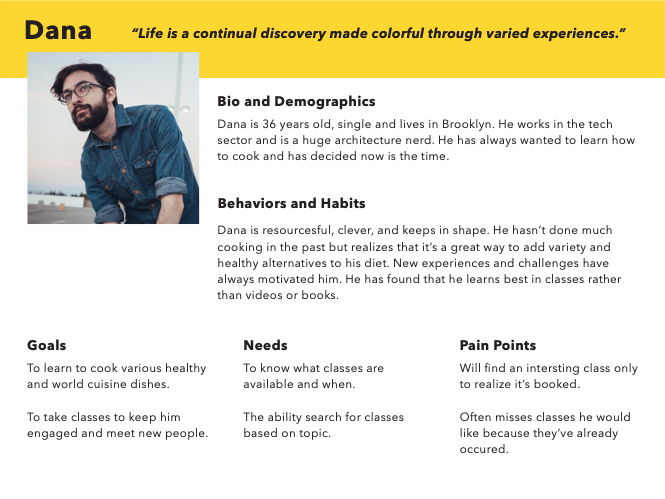
From the beginning of this project, we were working with a persona representing a Brooklyn Brainery site user. Our persona wants to take classes at the Brooklyn Brainery, and is frustrated when he misses out on classes.
We analysed the information architecture of the existing website, performing competitive and comparative business analysis, user testing in the form of tree testing and open/closed card sorting, and heuristic evaluation.
This helped us identify the existing site's pain points and areas of confusion, and set the direction of our redesign. Once we had a proposed redesign, we created sitemaps for the existing and the proposed navigation, and repeated tree testing and card sorting to compare results from before and after the redesign.
Problem Space
Both our initial problem statement and our revised problem statement focused on our persona’s frustration at missing classes. After round 1 of testing, the focus shifted more specifically towards the features of the classes he is looking for, and the role of the website in finding the classes. This is reflected in the revised problem statement.
Initial Problem Statement
・Classes at Brooklyn Brainery fill up quickly.
・As a result, adults who are interested often miss a class before it is full.
・How might we help them find classes and avoid missing the classes they want?
・Classes at Brooklyn Brainery fill up quickly.
・As a result, adults who are interested often miss a class before it is full.
・How might we help them find classes and avoid missing the classes they want?
Revised Problem Statement
・There is no search or filter function for classes on the Brooklyn Brainery website.
・As a result, Dana does not see the popular, recently-added classes that are most relevant to him until after they are full or completed.
・How might we help Dana find and sign up for the classes that best match his requirements, before the classes end or fill up?
BUSINESS RESEARCH PHASE ⋄ Discover + Define
Business Model Canvas
Goal
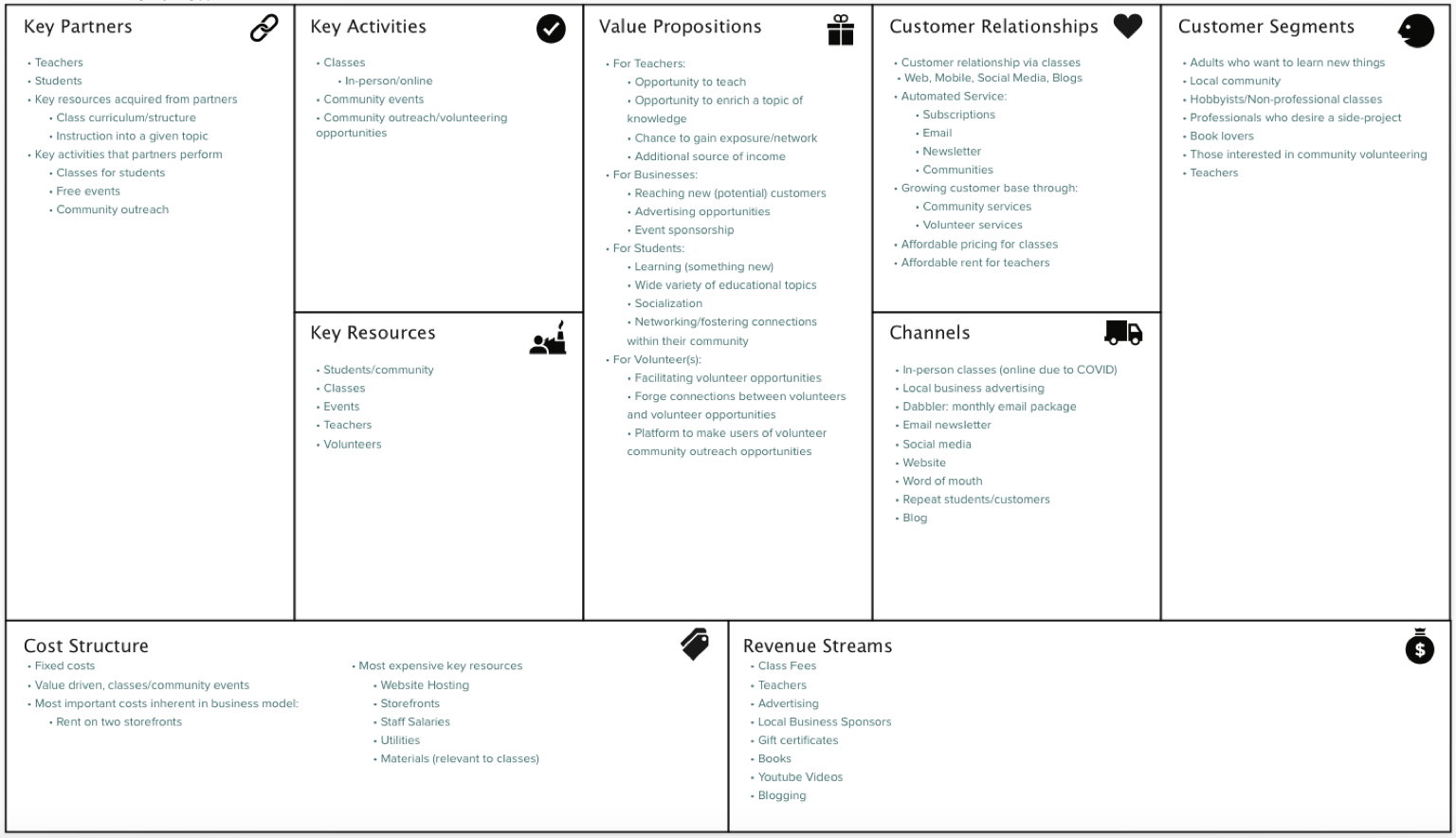
Before beginning to examine Brooklyn Brainery’s information architecture, we first needed to get a better understanding of what Brooklyn Brainery is. To do this, our team created a business model canvas.
Before beginning to examine Brooklyn Brainery’s information architecture, we first needed to get a better understanding of what Brooklyn Brainery is. To do this, our team created a business model canvas.
Key findings
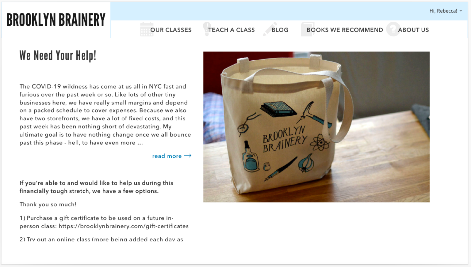
Brooklyn Brainery, like many businesses across the world, has been significantly impacted by COVID. As a result, they’ve had to adapt their class structure from one that is traditionally local and in-person, to one that is (presently) hosted online. Brooklyn Brainery not only offers classes, but is also involved in their community and facilitates community volunteer outreach opportunities. Our main takeaway was that Brooklyn Brainery strives to be a focal point within their community to bring people together, whether by mutual interest in learning a new skill, or, a general desire to socialize and volunteer.
Brooklyn Brainery, like many businesses across the world, has been significantly impacted by COVID. As a result, they’ve had to adapt their class structure from one that is traditionally local and in-person, to one that is (presently) hosted online. Brooklyn Brainery not only offers classes, but is also involved in their community and facilitates community volunteer outreach opportunities. Our main takeaway was that Brooklyn Brainery strives to be a focal point within their community to bring people together, whether by mutual interest in learning a new skill, or, a general desire to socialize and volunteer.
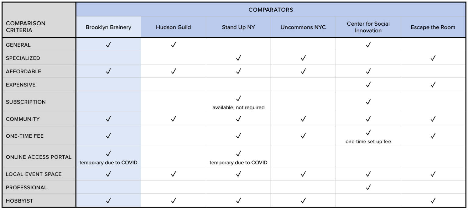
Competitive Business Matrix
We created a matrix of some similar businesses and organizations as Brooklyn Brainery:
Competitive Business Analysis
Goals
・To analyze Brooklyn Brainery and their competitors and get a better understanding of their features
・To analyze Brooklyn Brainery and their competitors and get a better understanding of their features
Outcome
・Categories with least overlap: Specialized, Subscription and Expensive (2/6)
・Category with the most overlap: Hobbyist (5/6)
・Categories with least overlap: Specialized, Subscription and Expensive (2/6)
・Category with the most overlap: Hobbyist (5/6)
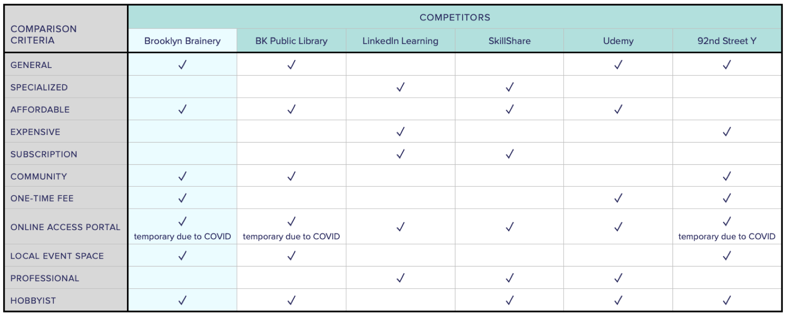
Comparative Business Analysis
Goals
・Analyze similar businesses that are not direct competitors
・Discover features that may benefit website redesign
・Analyze similar businesses that are not direct competitors
・Discover features that may benefit website redesign
Outcome
・Categories with least overlap: Professional (1/6)
・Category with the most overlap: Local Event Space, Community (6/6)
・Categories with least overlap: Professional (1/6)
・Category with the most overlap: Local Event Space, Community (6/6)
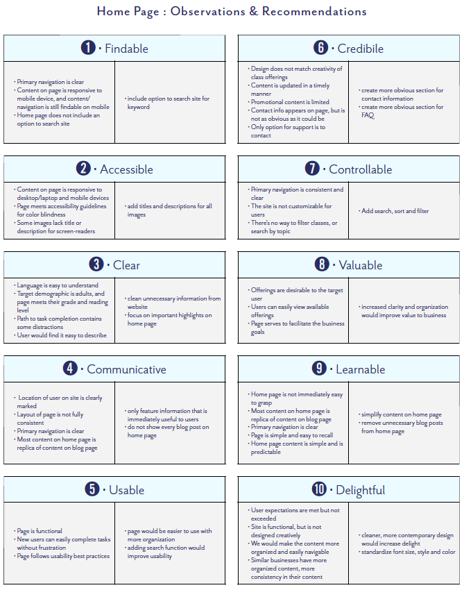
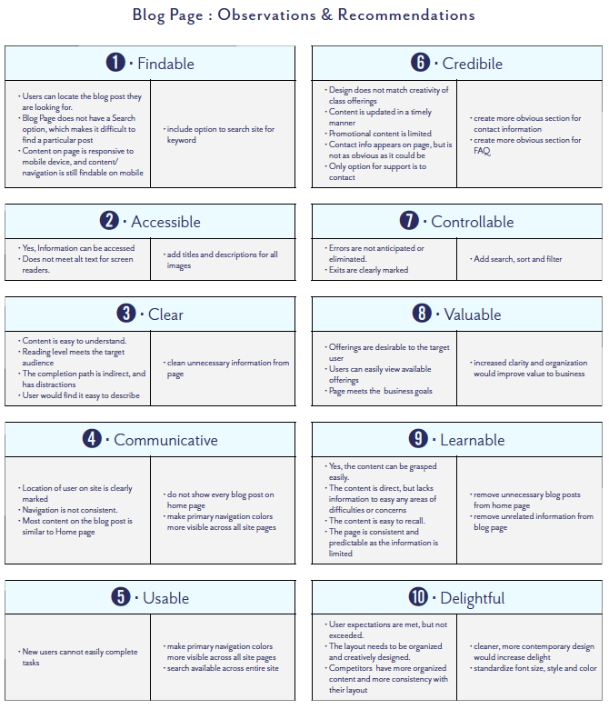
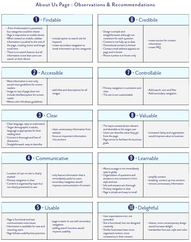
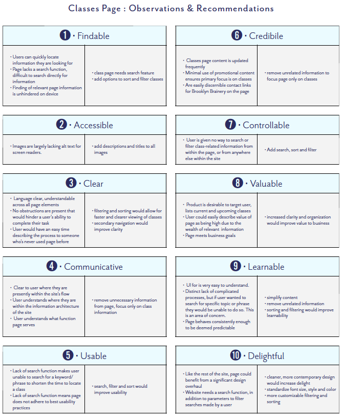
HEURISTIC EVALUATION
Goals
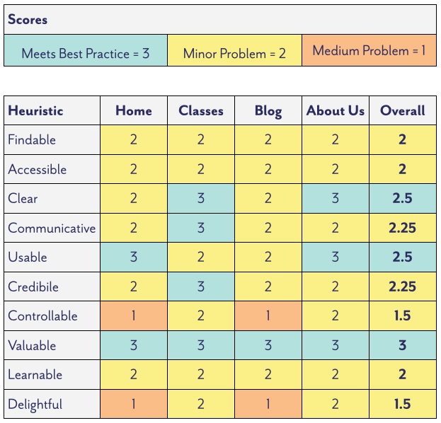
・We looked at 4 pages from Brooklyn Brainery's website, and measured them against 10 heuristic criteria.
・We recorded our qualitative observations as measurable criteria for our scores.
・We looked at 4 pages from Brooklyn Brainery's website, and measured them against 10 heuristic criteria.
・We recorded our qualitative observations as measurable criteria for our scores.
Findings
・Over 4 pages and 10 criteria each, we gave 40 total scores.
・Percentage of each score out of 40 total scores:
・Over 4 pages and 10 criteria each, we gave 40 total scores.
・Percentage of each score out of 40 total scores:
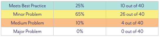
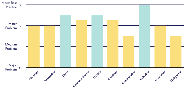
・Although there were problems with the majority of pages, no page was found to fail or have a major problem
・The "valuable" heuristic had the highest score, with no page falling below a score of 3
・"Controllable" and "delightful" tied for the lowest scores, with an average score of 1.5
・The "valuable" heuristic had the highest score, with no page falling below a score of 3
・"Controllable" and "delightful" tied for the lowest scores, with an average score of 1.5
USER RESEARCH
Existing Navigation
Tree Testing
Round 1 of our tree testing had a success rate of 88%, and a directness score of 72%. There were 11 total participants and 33 tasks total. 29 tasks were completed successfully, 4 incorrectly.
Round 1 of our tree testing had a success rate of 88%, and a directness score of 72%. There were 11 total participants and 33 tasks total. 29 tasks were completed successfully, 4 incorrectly.
Closed Card Sorting
・Users sorted 87% of cards in same categories as site, 13% differently
・The category with the most uncertainty was the Blog followed by About Us
・Users had difficulty differentiating between blog posts, class titles, and info from About Us
・Users sorted 87% of cards in same categories as site, 13% differently
・The category with the most uncertainty was the Blog followed by About Us
・Users had difficulty differentiating between blog posts, class titles, and info from About Us
Open Card Sorting
Users had the chance to create their own category titles for cards, which we compared to the existing categories
・No user thought of "Blog" as a possible category
・"About Us" seemed to have the most overlap
・Users did not see a distinction between different class topics, and created one category for all classes
Proposed Navigation
Tree testing
Round 2 of tree testing had a success rate of 87%, and a directness score of 73%. There were 10 total participants and 30 tasks total. 26 tasks were completed successfully, 4 incorrectly.
Round 2 of tree testing had a success rate of 87%, and a directness score of 73%. There were 10 total participants and 30 tasks total. 26 tasks were completed successfully, 4 incorrectly.
Closed Card Sorting
・We had similar results for both rounds of closed card sorting
・Users sorted 85% of cards in same categories as site, 15% differently
・We had similar results for both rounds of closed card sorting
・Users sorted 85% of cards in same categories as site, 15% differently
SITEMAPS and USER FLOW
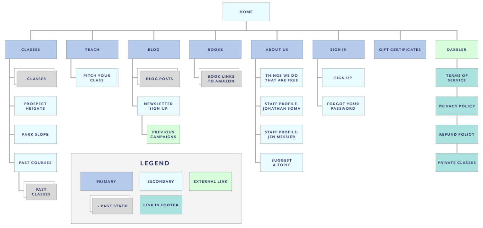
Existing Navigation
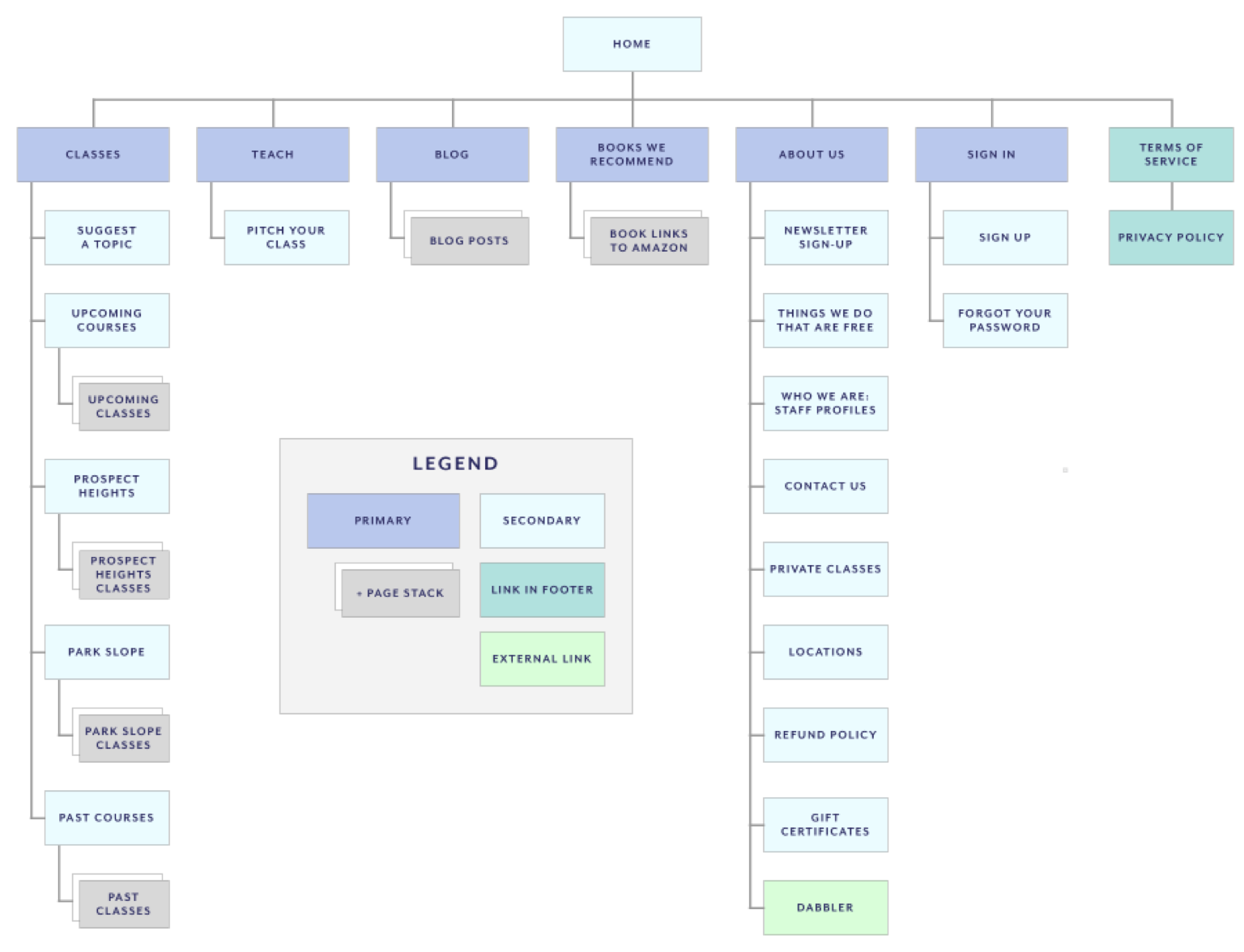
Proposed Navigation
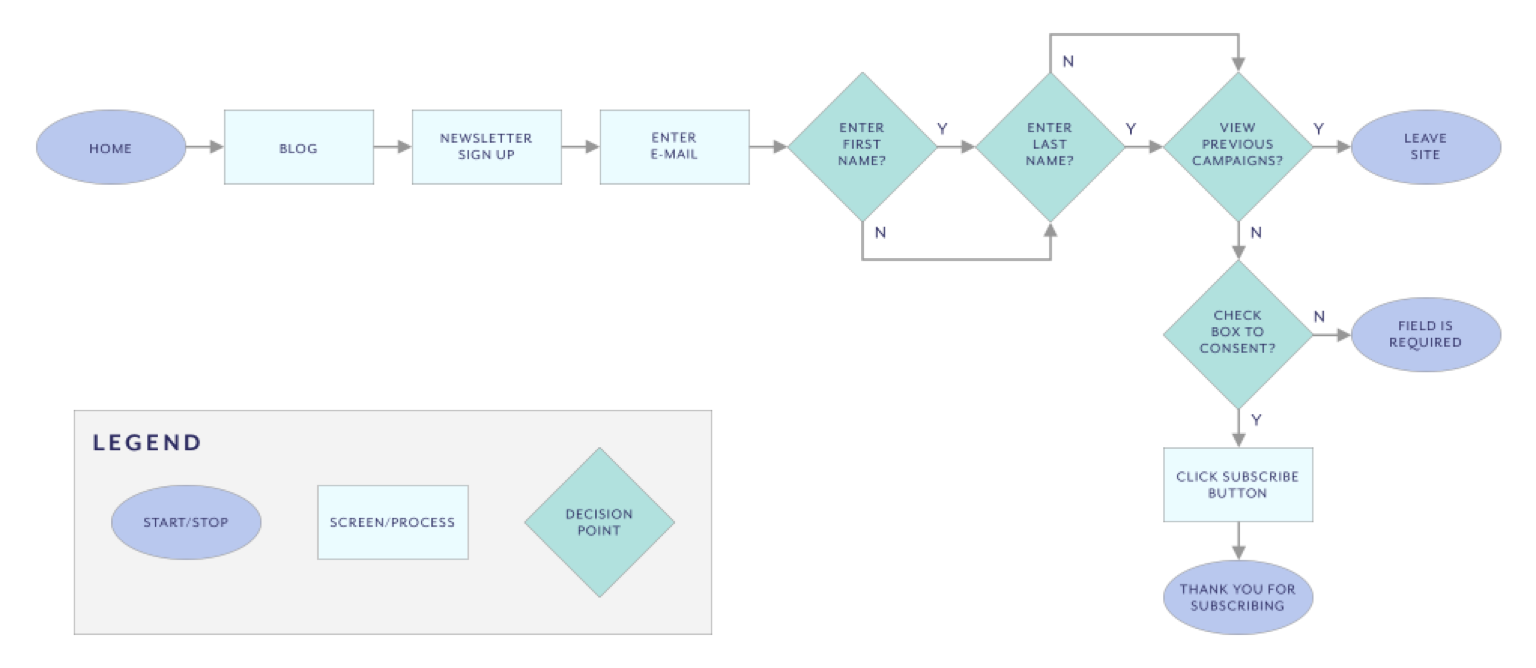
Existing User Flow
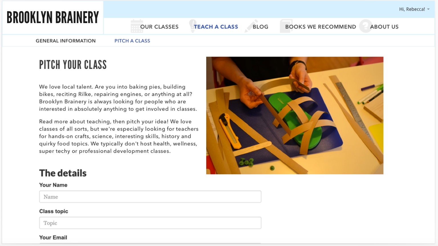
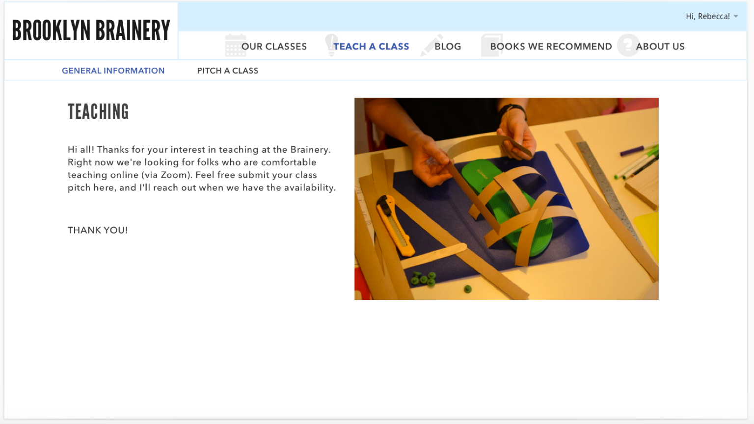
HIGH-FIDELITY WIREFRAMES
Proposed Navigation