
What is Project Petals?
Project Petals is a non-profit organization based in New York City that focuses on environmental and community development, specifically within low-income or underserved neighborhoods.
The leadership team of Project Petals was responsible for organizing projects, coordinating volunteers, setting up events, and recruiting community leaders. The founder of Project Petals, Alicia White, contacted our UX team to discuss better ways to connect volunteers to projects.
Our goal for the project was to create a new volunteer portal for Project Petals that would supplement their existing website. This new site would simplify the process of volunteering for both the volunteers and the organizers, provide information about past and upcoming events, and provide a way for anyone to submit an idea for a new project.
What Project Petals Needed
Our 4-person UX team had an initial meeting with the founder of Project Petals, Alicia White, to learn about her needs and requirements for the project. She gave us an overview of what problems we need to address, and we we left the meeting with an idea of the goals and requirements for our design.
• Create a volunteer portal to connect volunteers with opportunities, supplementing the existing Project Petals website
• The portal has to work on mobile devices, either as an app or a responsive website
• While visibility of volunteer events is important, protect the privacy of organizers and volunteers
• The portal has to work on mobile devices, either as an app or a responsive website
• While visibility of volunteer events is important, protect the privacy of organizers and volunteers
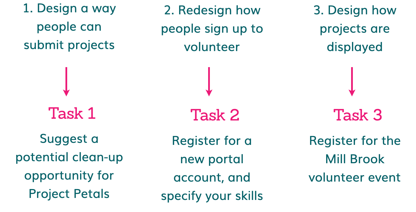
Our 3 Main Design Goals
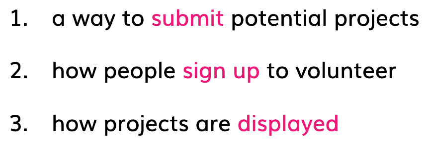
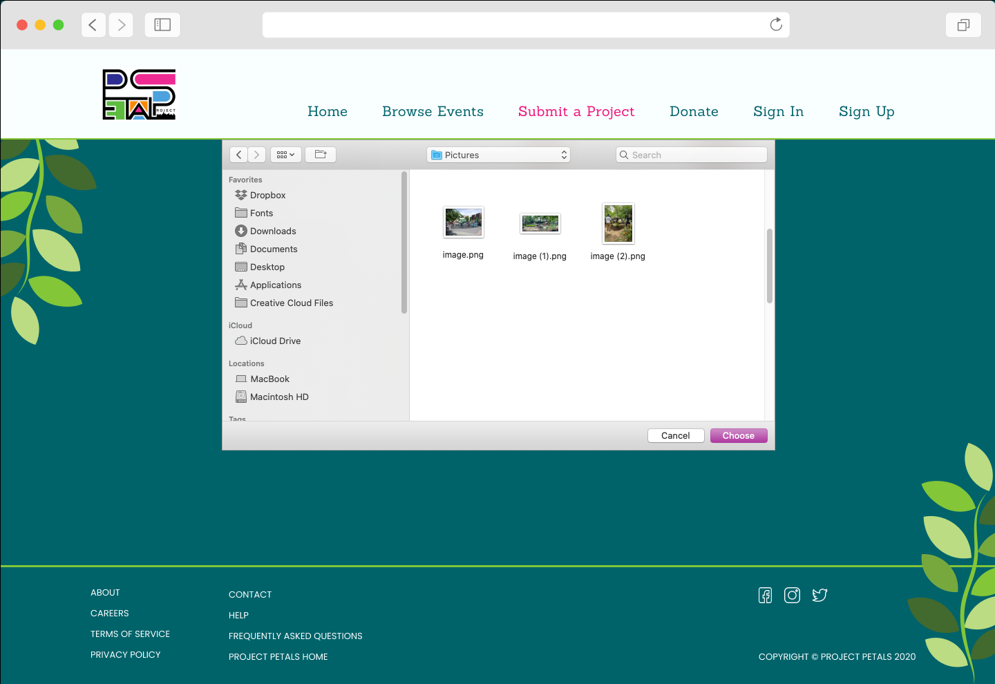
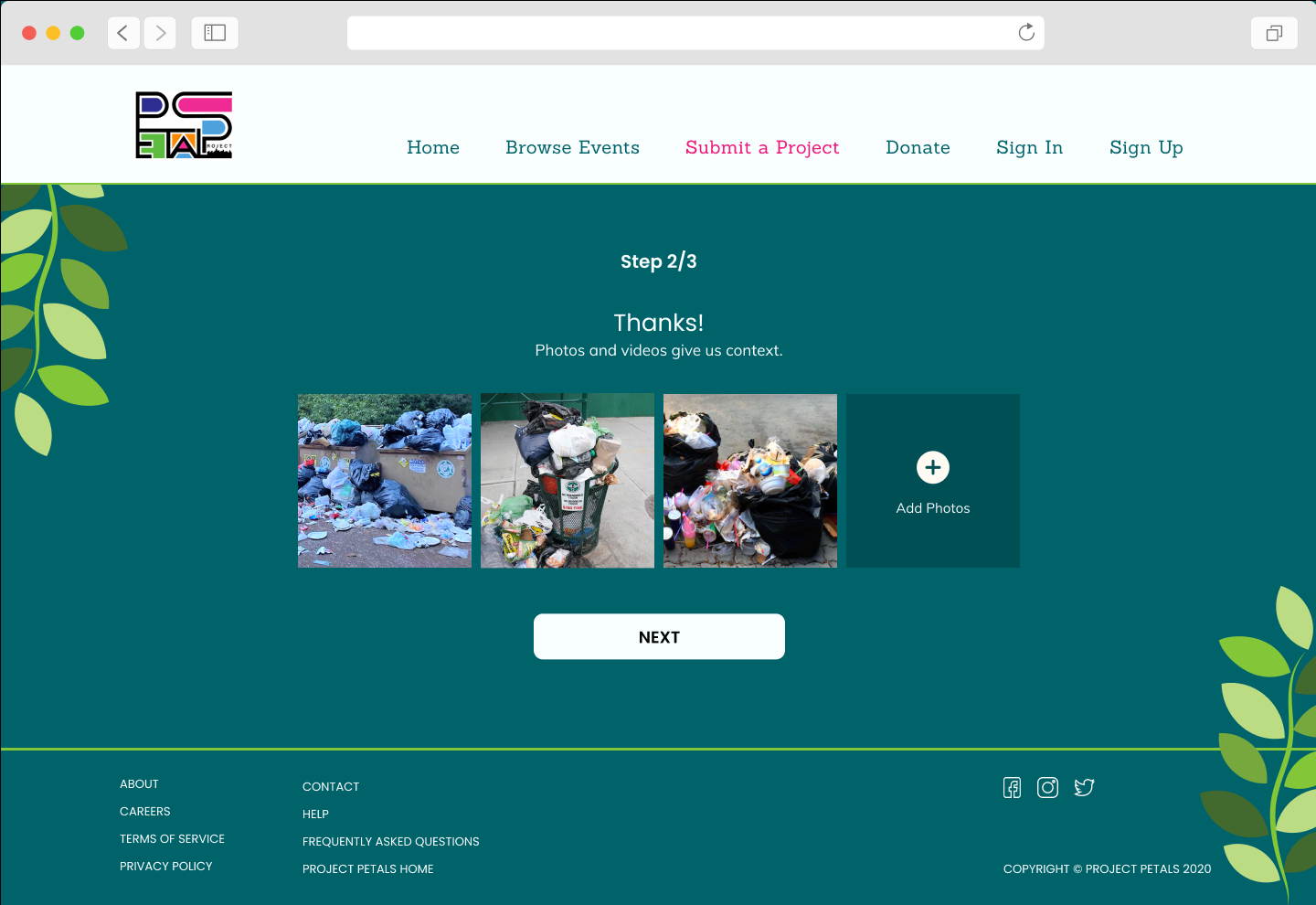
1 • Allow users to submit ideas for new projects, with photos or videos
2 • Provide ability for users to sign up to volunteer for events
3 • Display ongoing projects
2 • Provide ability for users to sign up to volunteer for events
3 • Display ongoing projects

PROBLEM SPACE
Our initial hypothesis focused on both volunteers and organizers, and the difficulties in connecting them to each other.
Hypothesis
It is difficult for aspiring volunteers to find and sign up for volunteer projects in their area.
Similarly, it is difficult for organizers to find volunteers for their projects.
Similarly, it is difficult for organizers to find volunteers for their projects.
Initial Problem Statement
People want to volunteer in their community but are not aware of where
to find or sign up for volunteer project opportunities.
to find or sign up for volunteer project opportunities.
As a result, potential volunteers and projects do not get connected.
How might we provide volunteers a readily available search and application process?
How might we provide volunteers a readily available search and application process?
PROCESS & METHODS
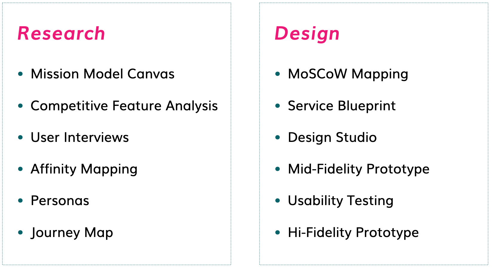
We started with business research to better understand Project Petals and examine features of similar organizations. Conducting interviews with target users illuminated common themes, needs, frustrations, goals and motivations of our potential users. Synthesizing these themes into features gave us the starting point for our design process.

STARTING OUR RESEARCH
As we entered into the research phase of the project, we kept in mind our three main goals:
User Interviews
We conducted six interviews with people who had experience volunteering, either for Project Petals or with other organizations. We asked the same set of questions during each interview, so that we could compare and synthesize their answers later to discover common and recurring themes.
Affinity Mapping
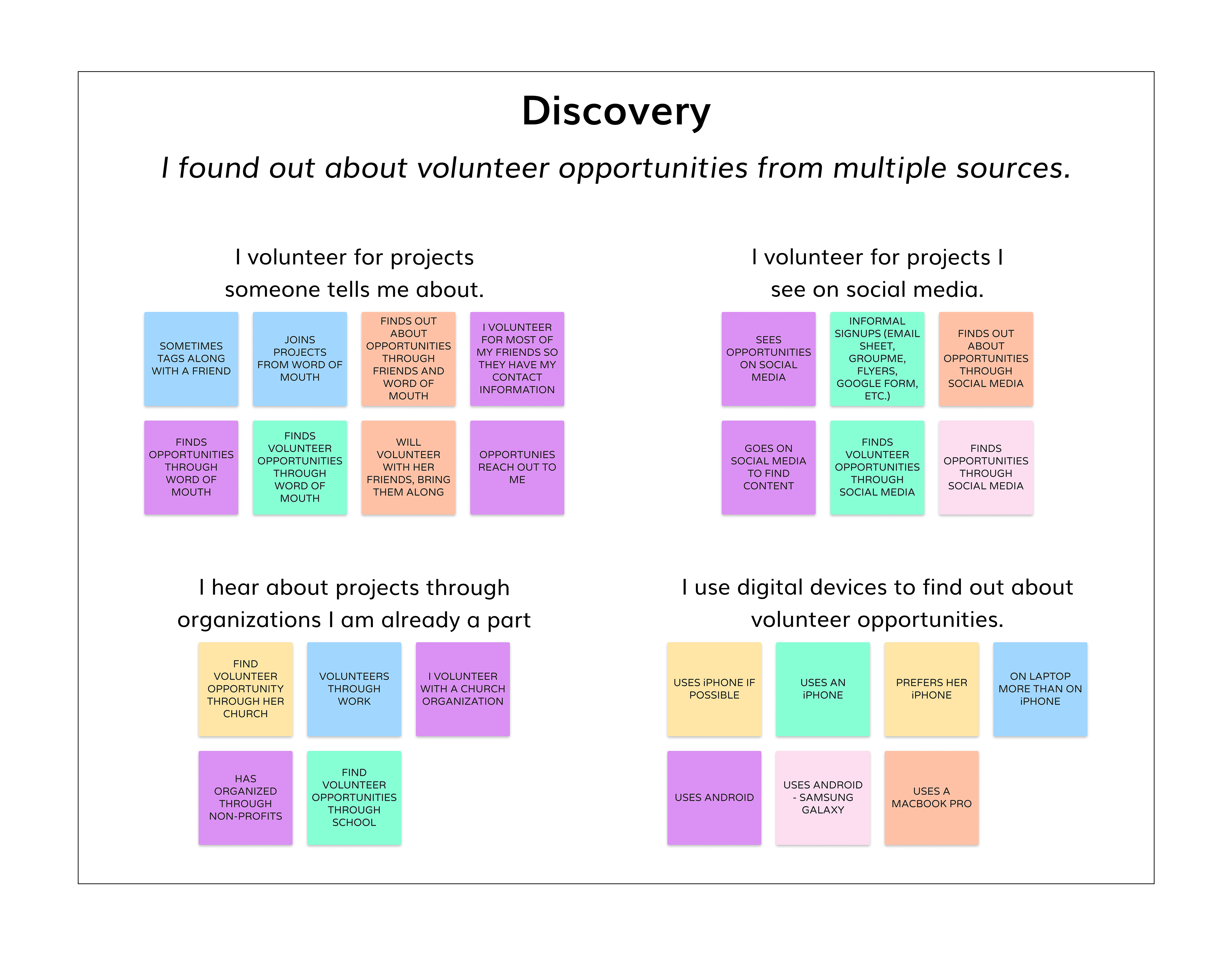
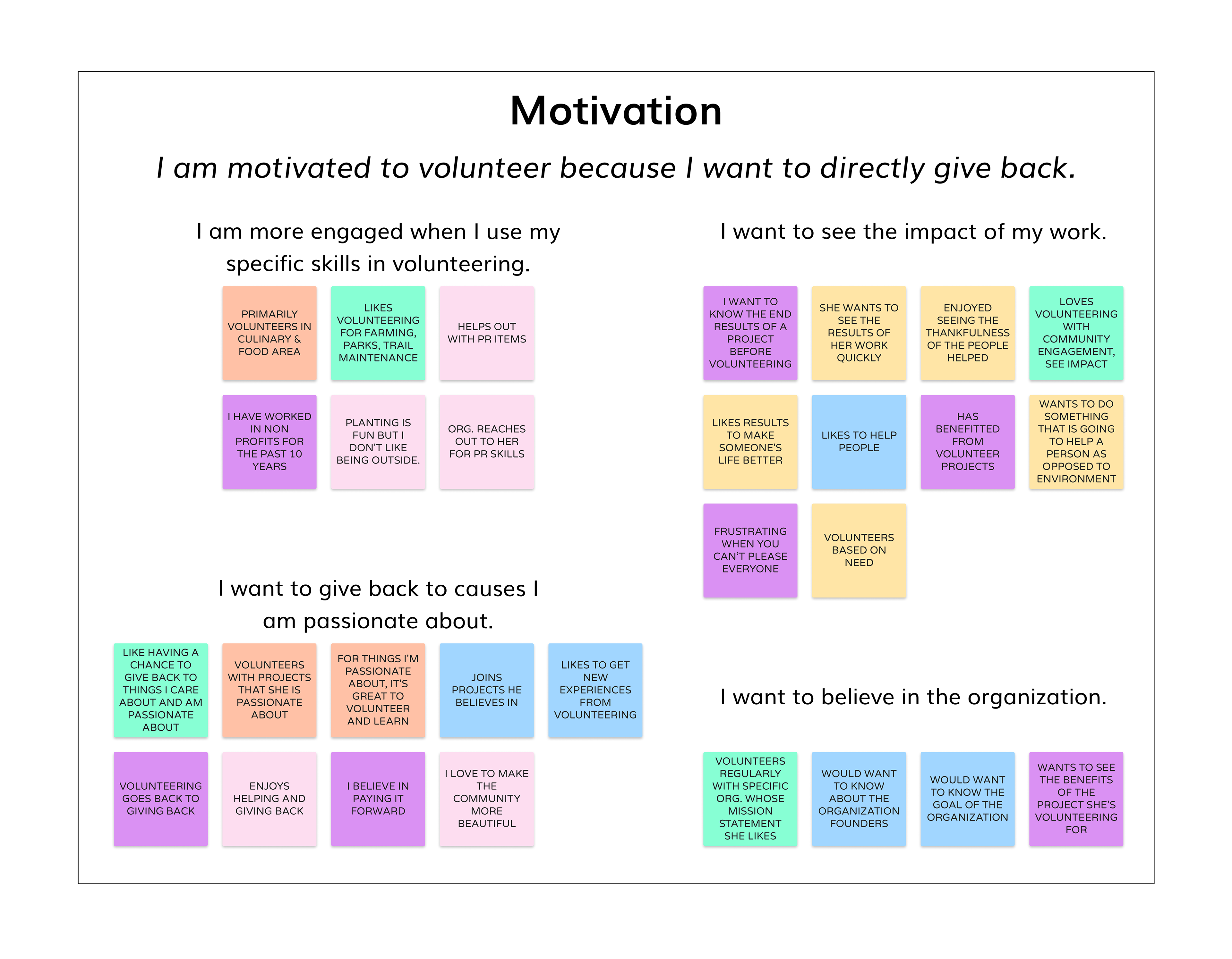
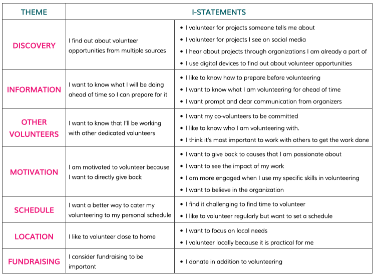
After completing the interviews, we moved on to affinity mapping to uncover common experiences and themes from our users. Our affinity mapping illuminated seven main themes from our interviews, with several sub-themes.
Discovery - how volunteers find out about volunteer opportunities
Information - what volunteers want to know about the projects
Other Volunteers - what people want in their fellow volunteers
Motivation - what drives people to volunteer
Schedule - how volunteering fits in with everyday work and life
Location - importance of finding local volunteer opportunities
Fundraising - how volunteers feel about donating their money vs. their time
Within the seven main themes, we created groups of sub-themes to further organize the responses from our interviewees. We rephrased the theme descriptions to be from the perspective of our potential target user.
Insights
From organizing the information from our user interviews into themes and I-statements, we identified seven insights that we would carry over into features in our design phase.
Volunteers find opportunities through word of mouth and social media
Volunteers want specific information about a project to be able to prepare
Organizations and volunteers need to be able to hold each other accountable
Volunteers are motivated when they believe in the cause and can have a direct impact
People need to be able to volunteer based on their personal schedule
People choose the location of where they volunteer based on local need and convenience
People donate as another way to give back
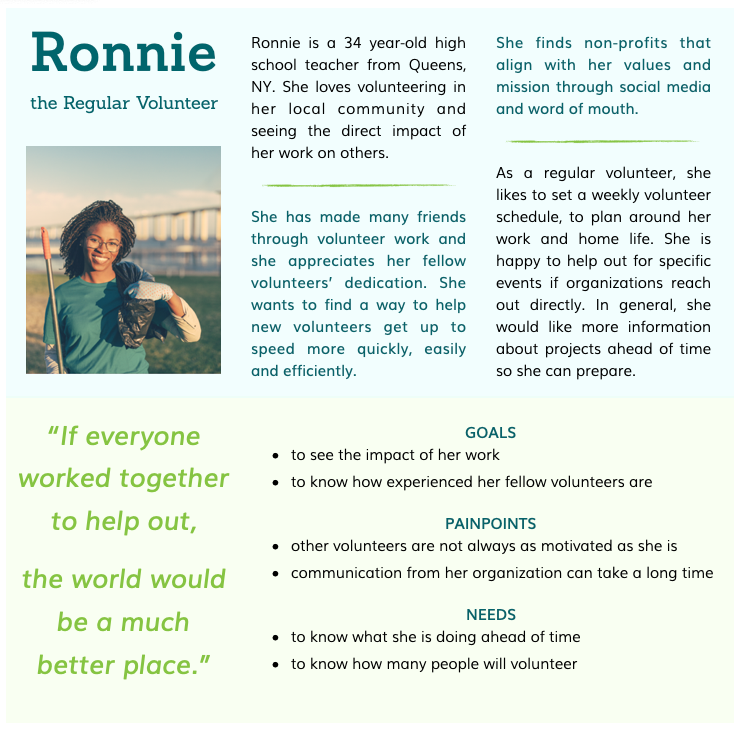
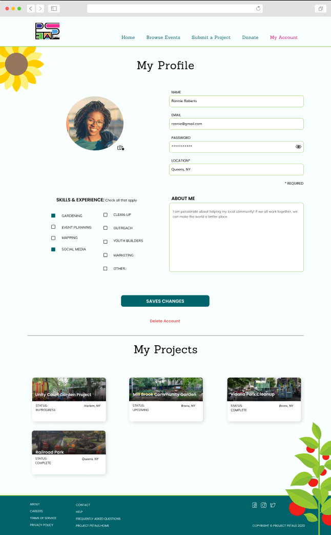
Our Target User
We took the information from our affinity map and developed a persona to represent our target audience. Introducing Ronnie, the regular volunteer. We would keep Ronnie in mind throughout the rest of the research phase and design phase, to ensure that we don’t lose sight of the needs of our target users.
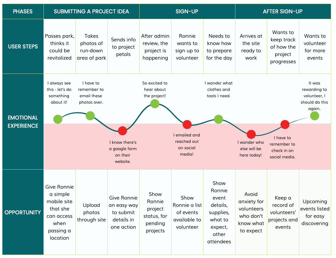
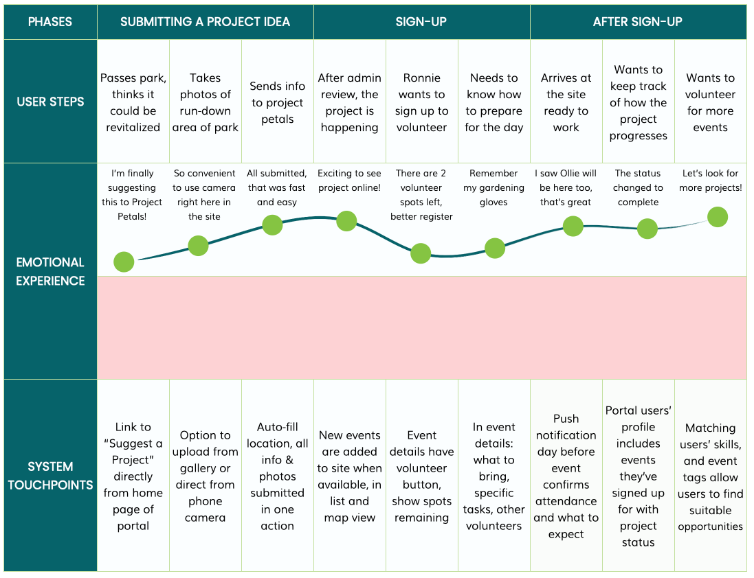
Ronnie's Volunteer Journey Map
We returned to our project goals - submitting a project, registering to volunteer, and displaying a list of projects - and considered Ronnie’s journey through scenarios that would test those goals.
This Journey Map visualizes Ronnie’s emotional state through the existing process of submitting a project and signing up to volunteer, without having a volunteer portal.
Revised Problem Statement
It was time to revisit our initial problem statement, and edit to more accurately reflect the needs of our target users.
People want to contribute to their local community, however, there is not a simple,
centralized way for people to get connected to opportunities.
centralized way for people to get connected to opportunities.
Problem: As a result, volunteers like Ronnie are not able to conveniently
view and submit information about volunteer projects.
view and submit information about volunteer projects.
Goal: How might we facilitate more project proposals
and formally connect volunteers to projects?
and formally connect volunteers to projects?

STARTING OUR DESIGN
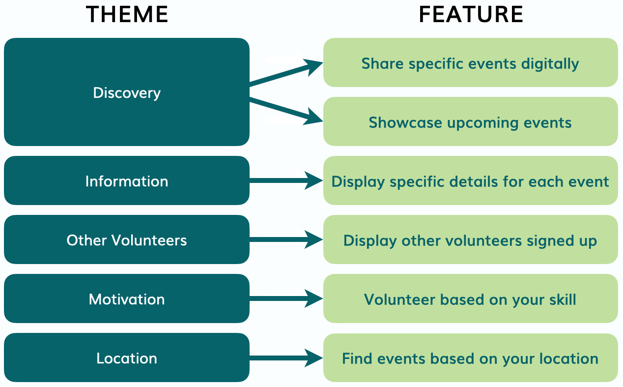
We looked at the main insights from our research, and identified ways to incorporate those as features into our initial designs.
We returned to our three goals for the portal’s functionality, and converted them into three related tasks for users to complete in usability testing.
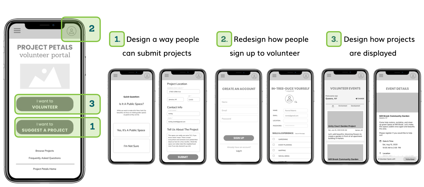
Design Stage 1: Low-Fidelity Sketches
Keeping the goals, features and tasks in mind, we started the design phase of the project. We conducted two design studio sessions: one for the four of us on the team, and one with Alicia, the founder of Project Petals. Our low-fidelity sketches got our design on the right track for future higher-fidelity iterations.
Design Stage 2: Mid-Fidelity Mobile
The next versions of our design were grayscale mid-fidelity screens. We established ideal screen-flows for our three tasks, and began a round of usability testing.
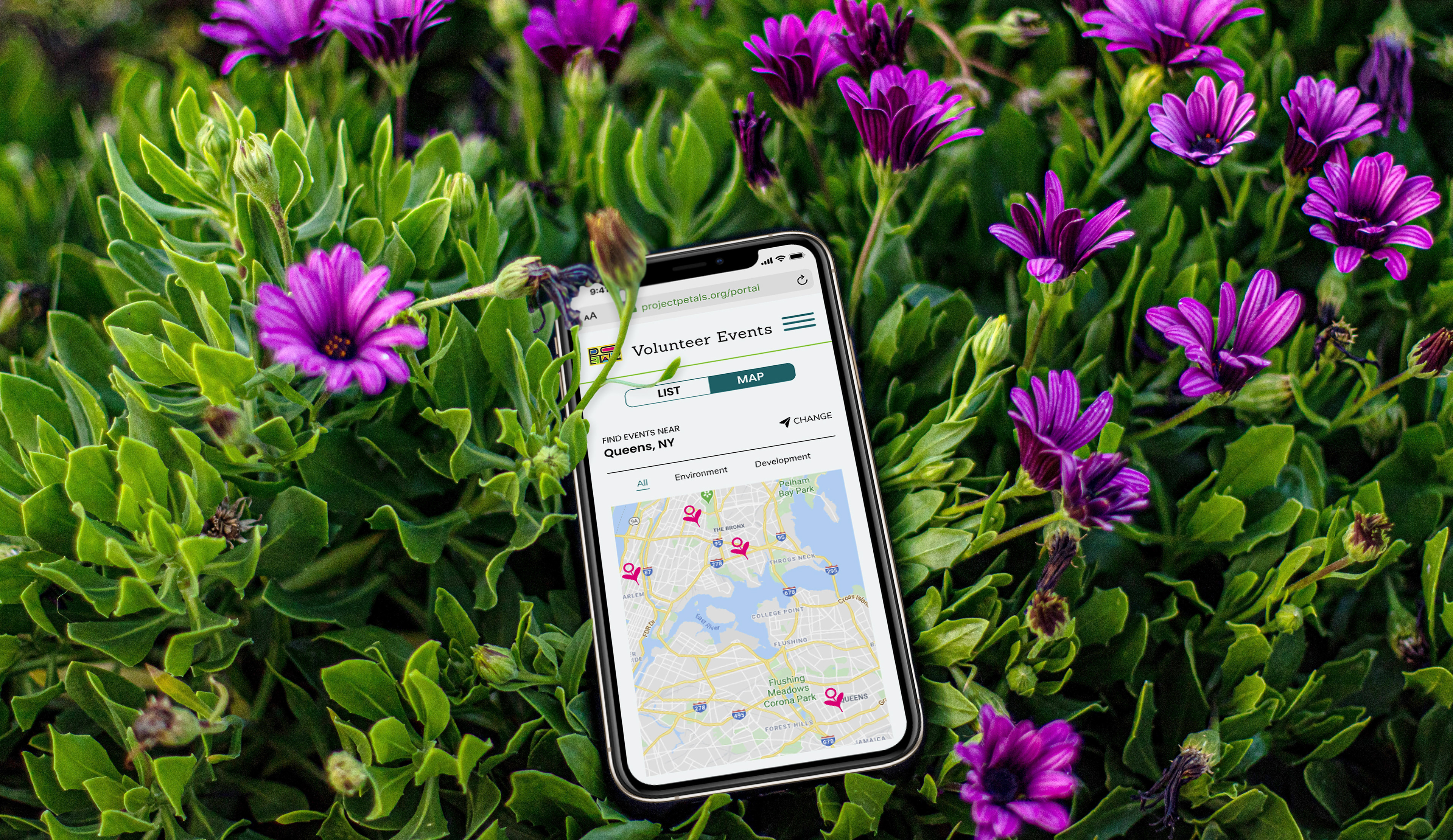
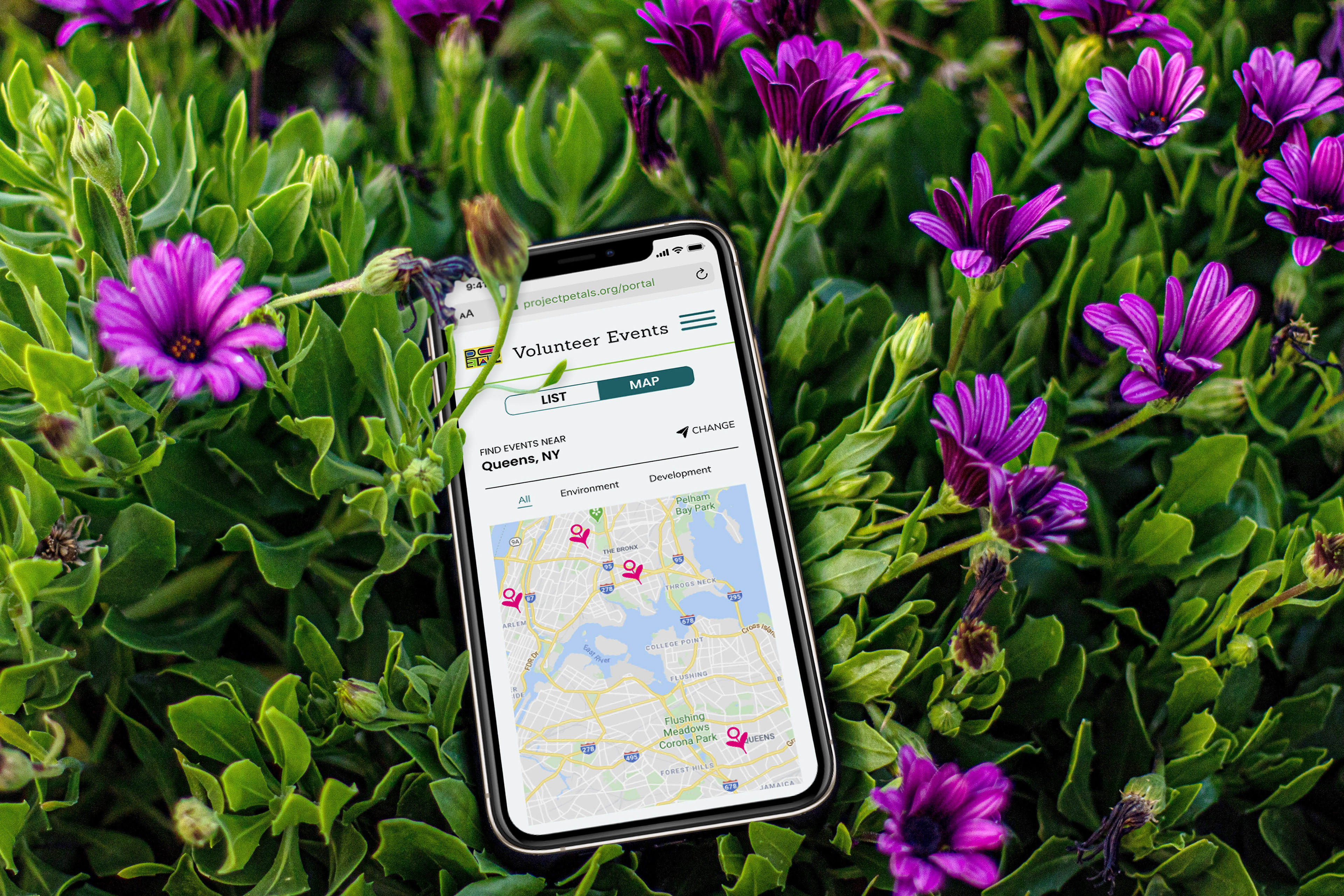
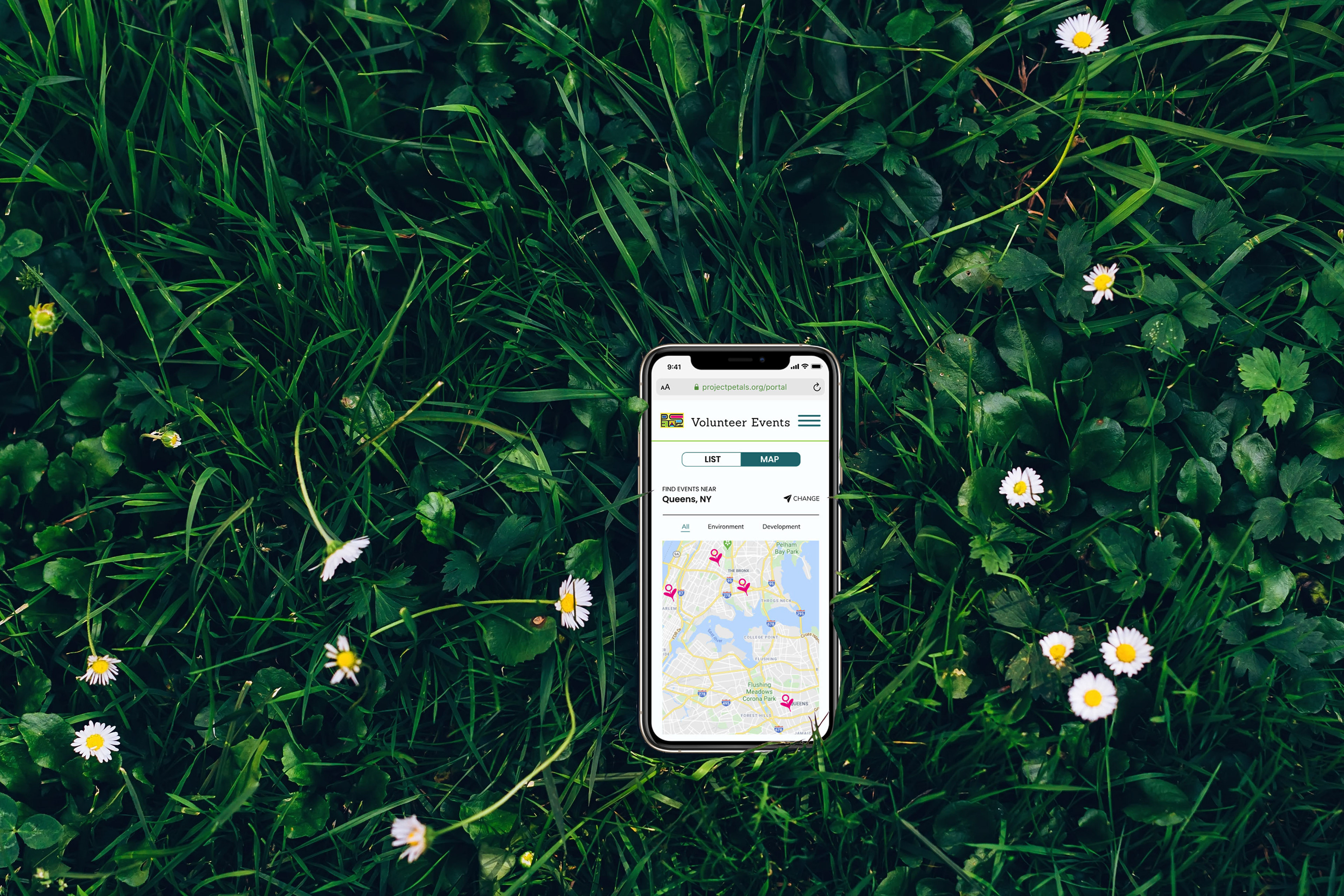
Volunteering Visibility vs. Privacy
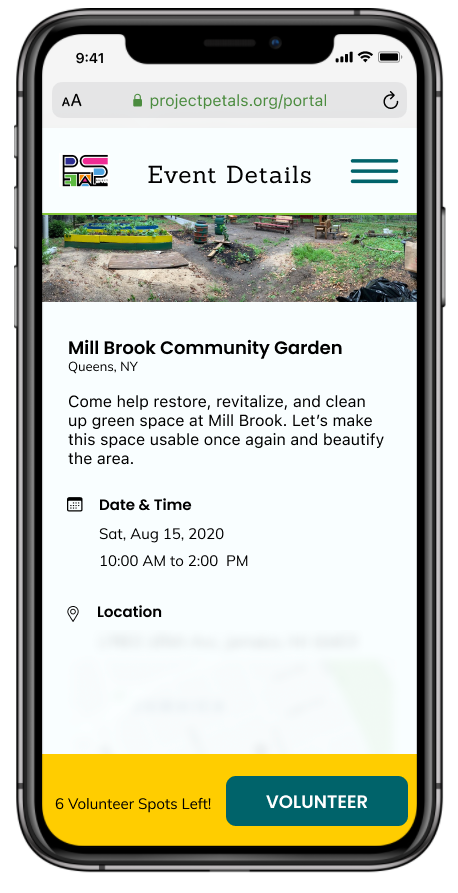
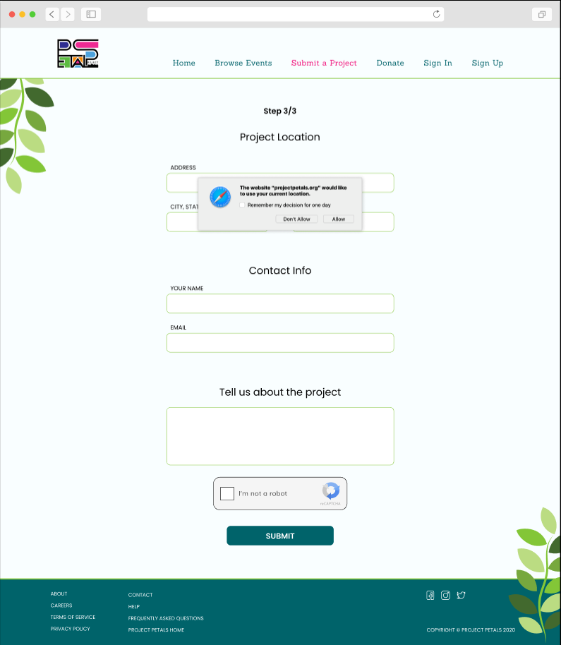
Protecting the privacy of volunteers and organizers was a requirement for our portal design from the beginning of the project. Many of the projects take place outside the homes of organizers and volunteers, and we don't want their personal address and contact information available to the public on the portal website.
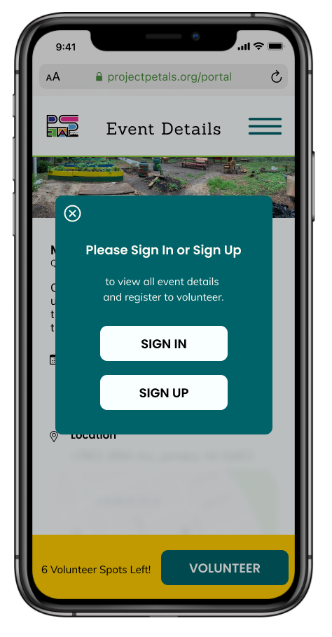
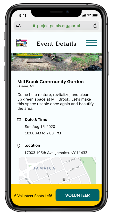
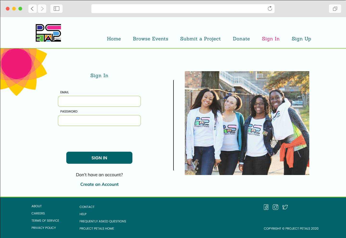
In addition to the privacy concerns, we wanted to keep some aspects of the volunteer projects visible to the public. Our solution was to require a portal account for any user who wants to volunteer for a project. Before they are signed in, they can view general details of an event, but no specific contact or location information. If they try to register for an event without being signed-in, they are prompted to sign-in or to create an account.
Our testing Task 2 provided valuable information to us about where users look for options to sign-in, and the order in which they approach volunteering for an event.
We found that when prompted to create an account for the purpose of volunteering, almost every user wanted to start by visiting the event details. In our final stage of design, we created two different versions of the event details pages: with blurred information when signed-out, and with full information when signed-in.
Design Stage 3: High-Fidelity Mobile 1
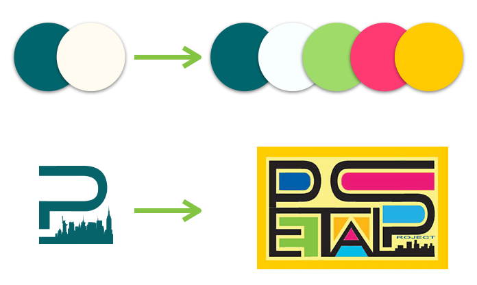
We converted the grayscale designs to color, and incorporated graphics, photos and typography. We designed a simplified version of the Project Petals logo, and went with a muted version of teal from the Project Petals website.
We wanted to address the challenges our users found with the second task: creating an account in order to volunteer for an event. Our first attempt to solve this was to add a third primary button to the home screen, so that "Sign In" was given as much weight as "Browse Events" and "Submit a Project."
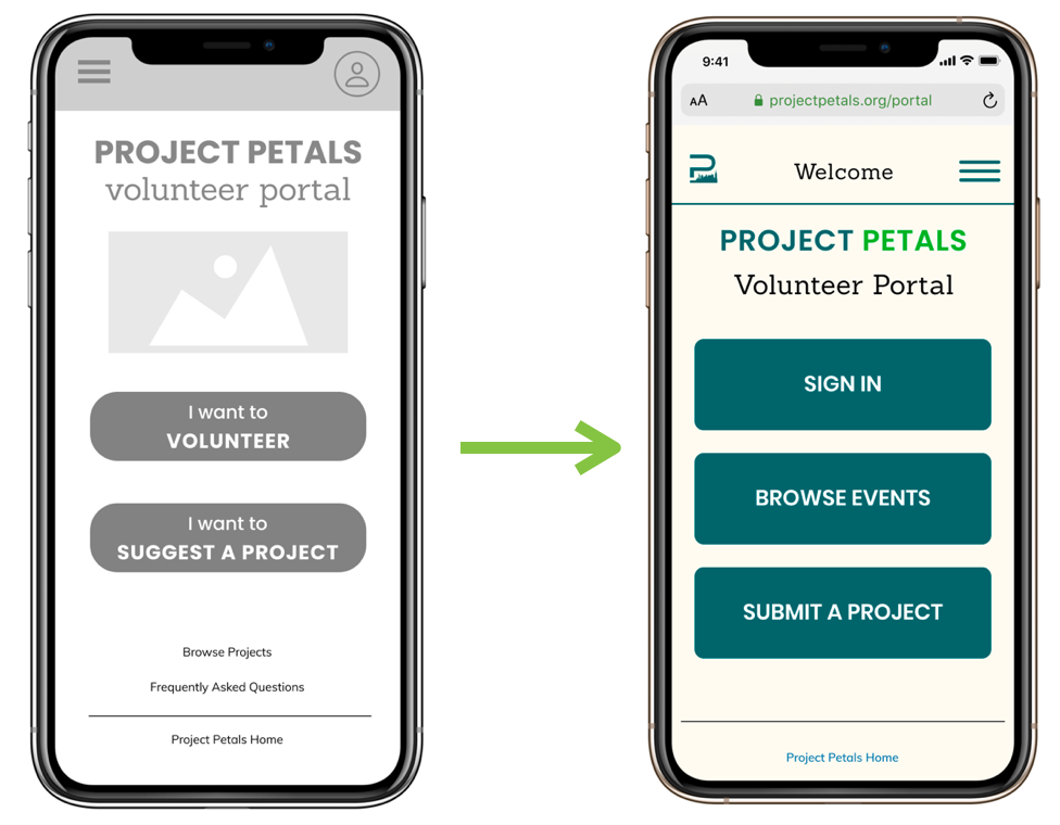
This resulted in some improvement in testing results, but still left some testers with confusion about the sign-in process. The mixed testing results and insights from our testing led us to the solution in our final High-fidelity prototypes.
Design Stage 4: High-Fidelity Mobile 2
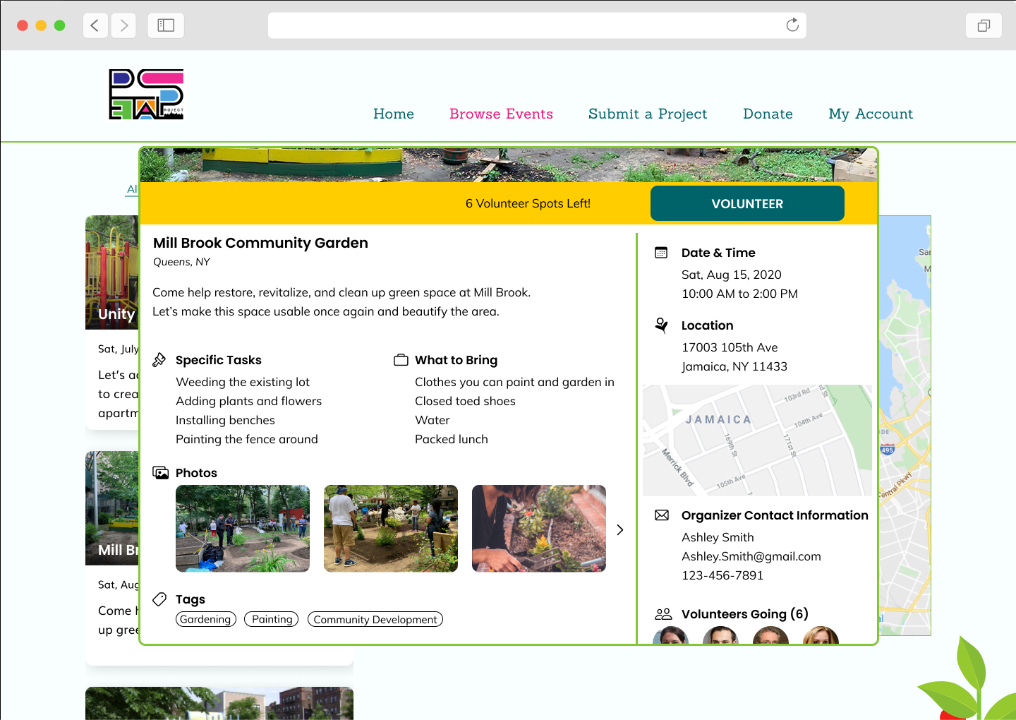
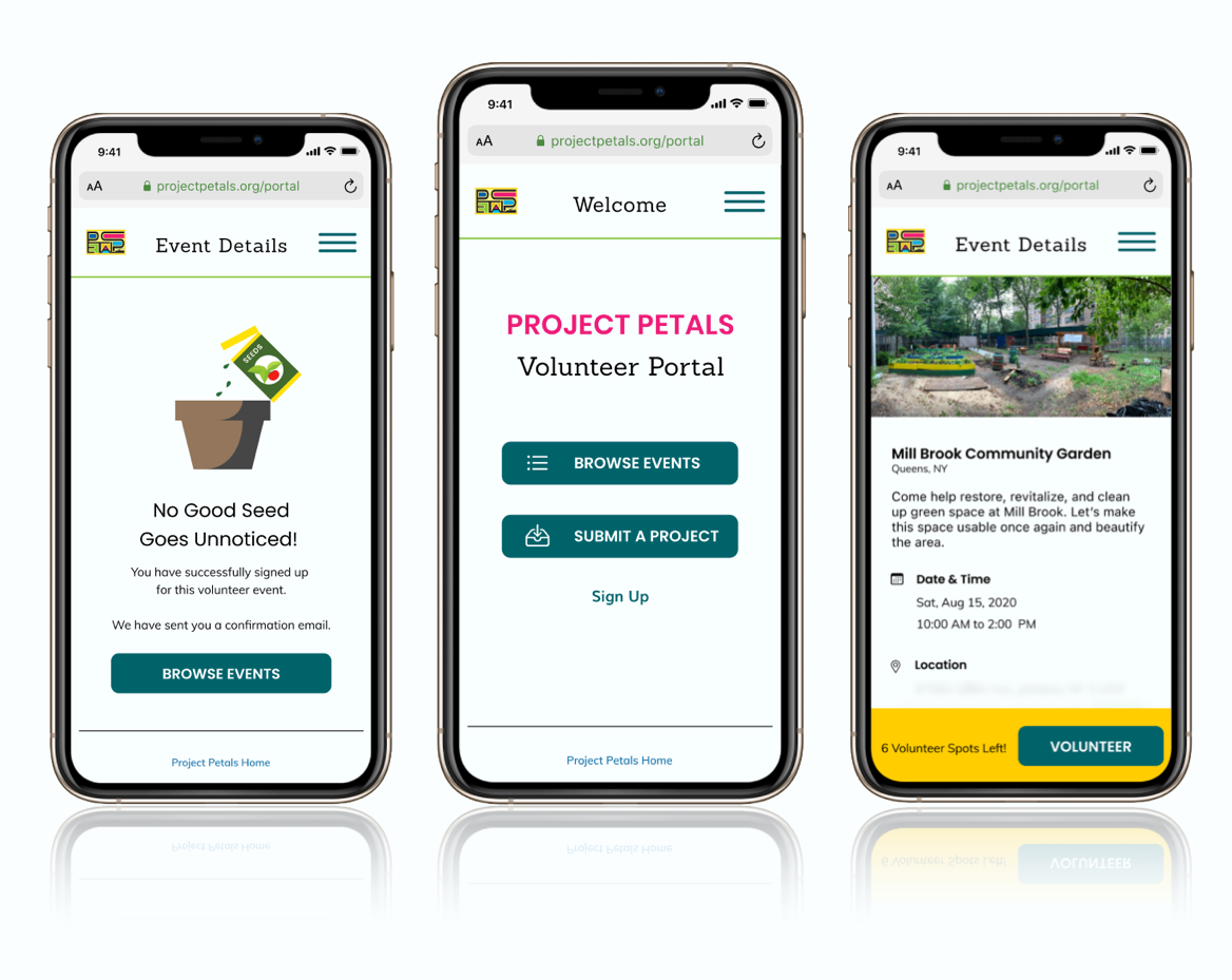
Evolution of the sign-in process, in the second iteration of high-fidelity mobile:
1. event details without sign-in - location, organizer contact info and other attendees are blurred
2. prompt to sign-in - clicking on "VOLUNTEER" button opens overlay with prompt to sign-in or sign-up
3. event details with sign-in - all location, contact and attendee information is visible
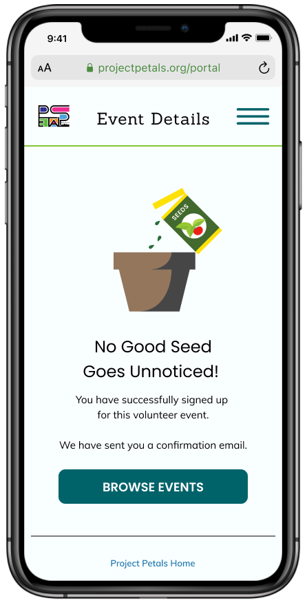
4. registration confirmation - clicking on "VOLUNTEER" button shows user confirmation of successful event registration
2. prompt to sign-in - clicking on "VOLUNTEER" button opens overlay with prompt to sign-in or sign-up
3. event details with sign-in - all location, contact and attendee information is visible
4. registration confirmation - clicking on "VOLUNTEER" button shows user confirmation of successful event registration
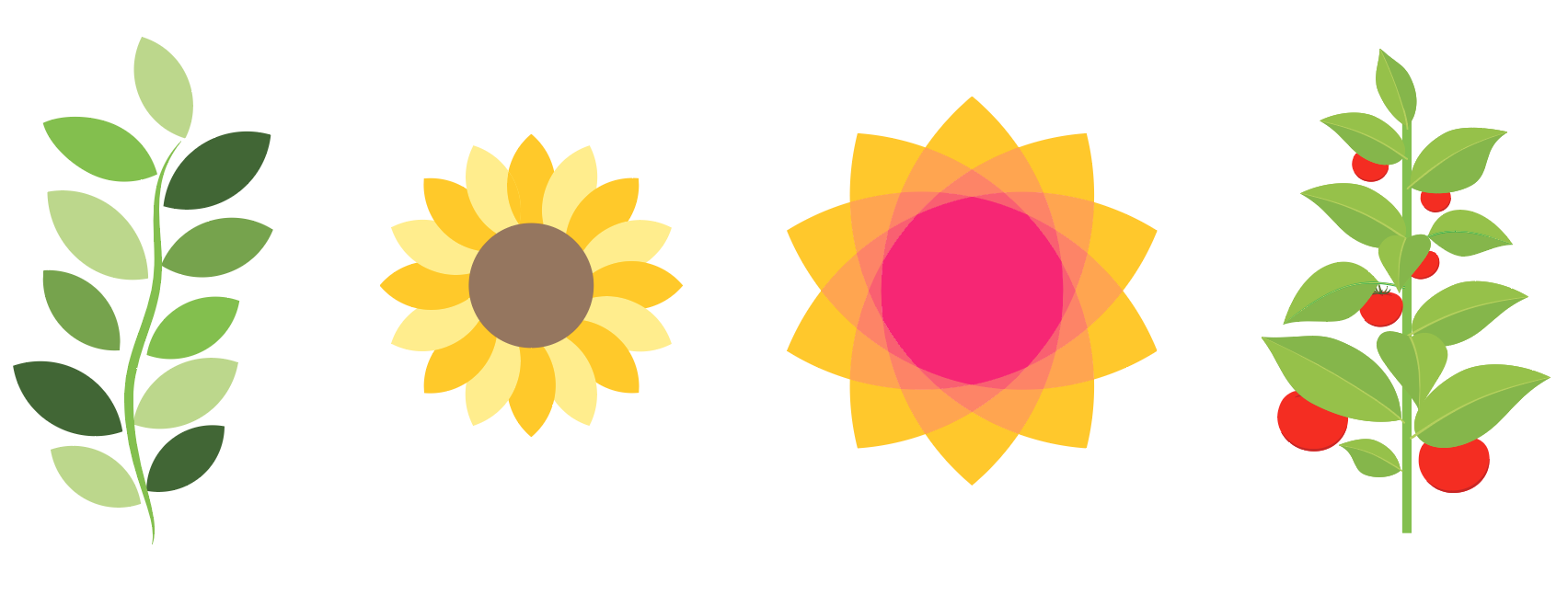
In addition to the navigation changes, the next iteration included more colors, life and personality. We got feedback from Alicia White, and she mentioned that the bright colors in her logo are a recognizable part of Project Petals identity. We wanted to remain conscious of accessibility guidelines, and kept the dark teal for its high contrast ratio score. The brighter green, pink and yellow became accent colors, and more graphics were added to reflect the organization's cheerful outlook.
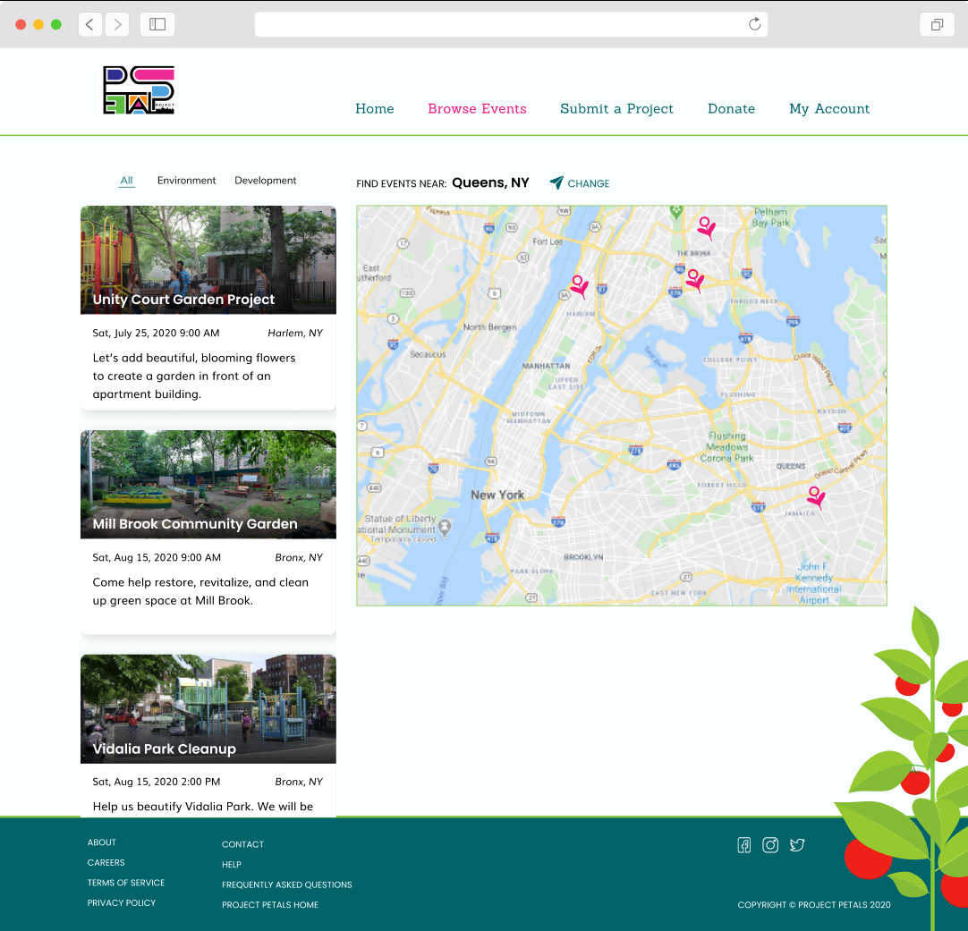
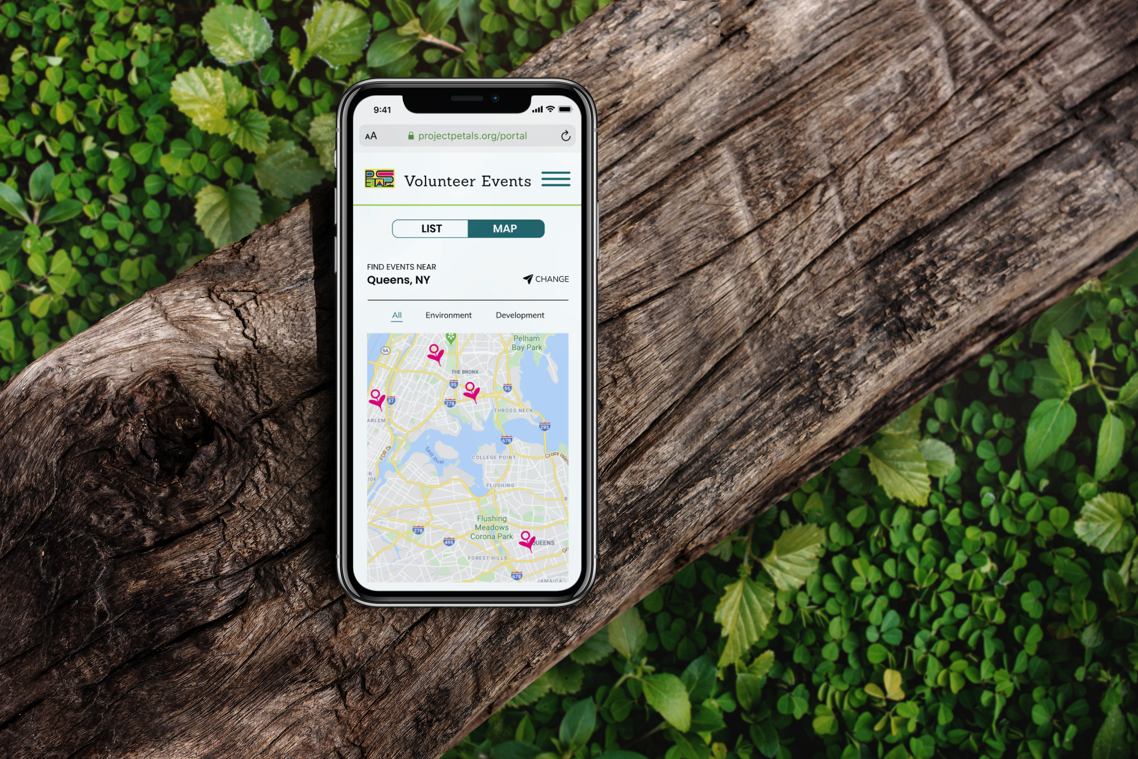
Design Stage 5: High-Fidelity Desktop
The larger screen area for the Desktop version allowed for more use of graphics.
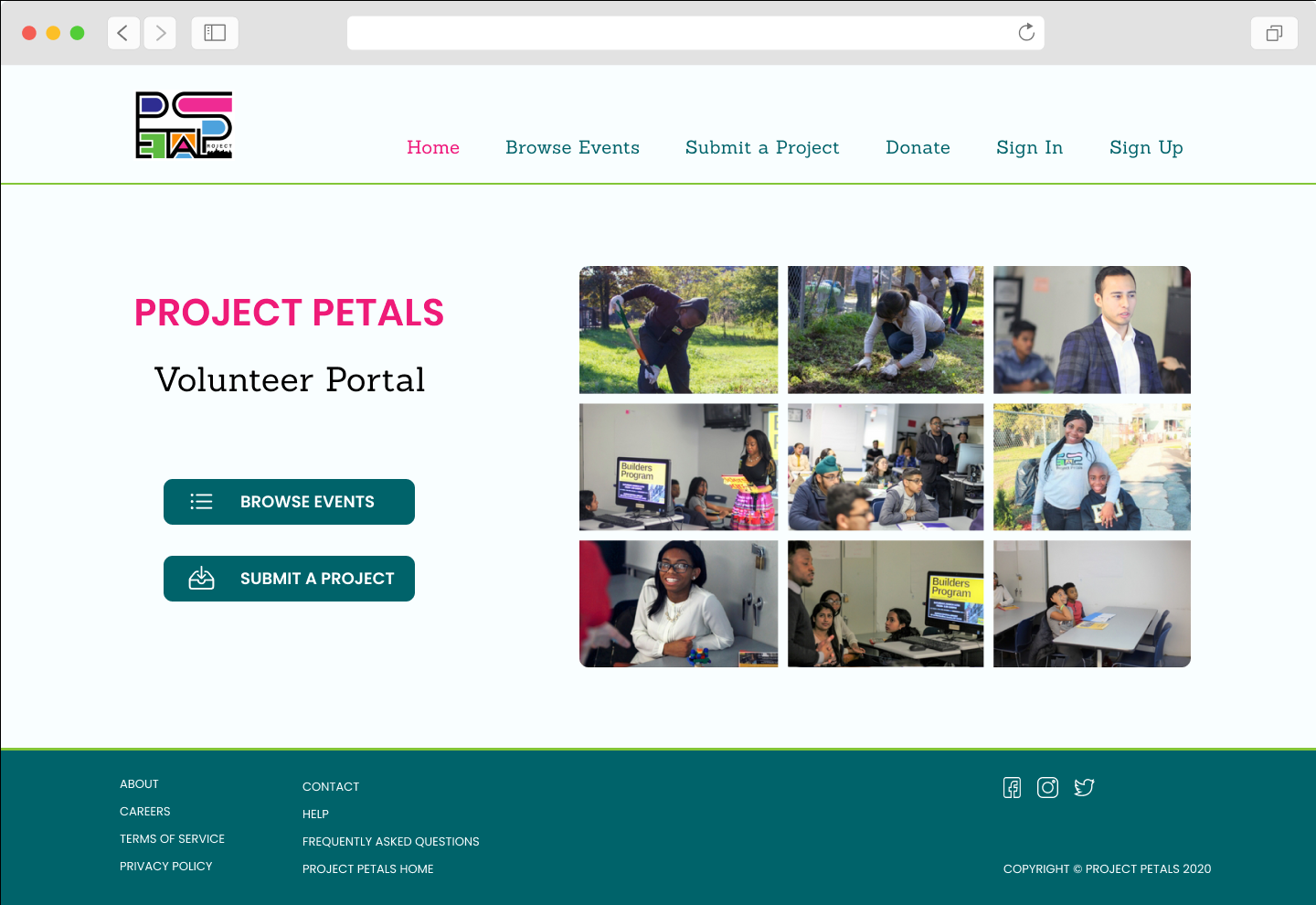
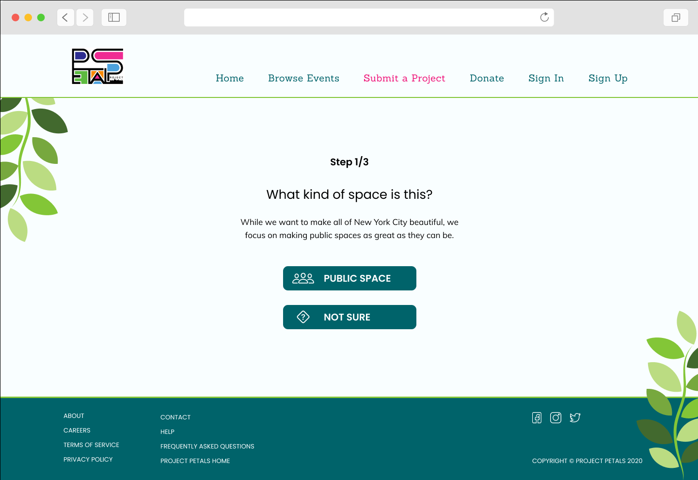
Final Prototypes

REVIEW
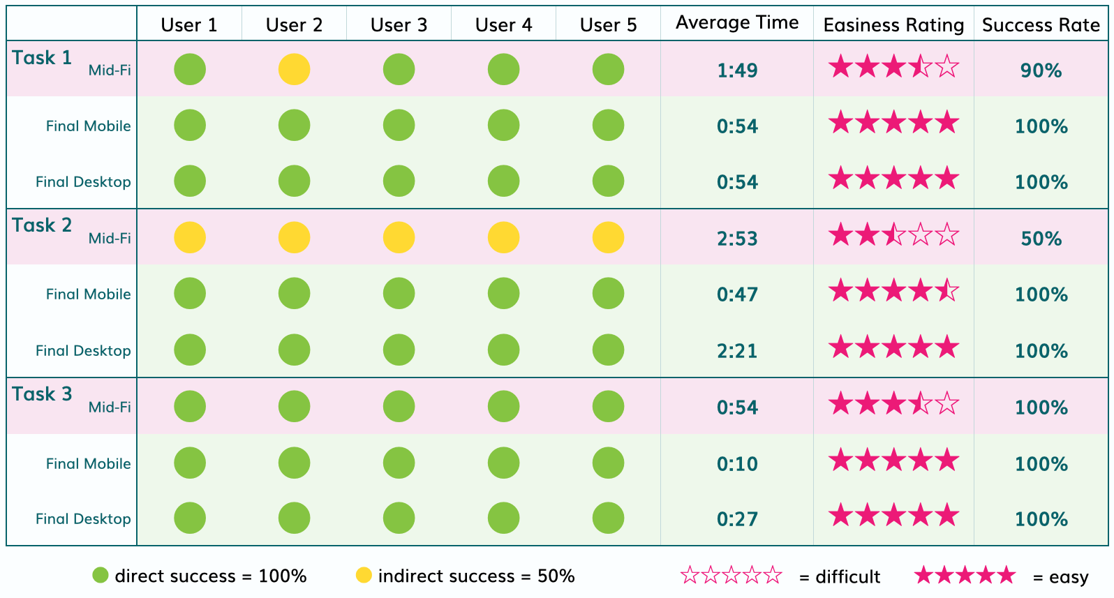
Patterns in Testing
We conducted usability tests after each design iteration, and found a positive trend in results between each step. Tasks 1 and 3 were not as challenging as the second task, but still showed improvement in time, success rate and easiness rating from baseline mid-fidelity to final high-fidelity designs.
The solution we landed on for the second task resulted in direct successes for all users, increased easiness ratings and decreased time needed to complete the task.
Proposed Journey Map
After creating and testing the high-fidelity version of our product, we returned to our persona, Ronnie's, Journey Map to compare her experiences from before to after having the portal. Ronnie’s previous journey had contained four main negative experiences, which gave us some clear targets for improvement in our design.
The final journey map illustrates how our product design addressed and improved the negative experiences.
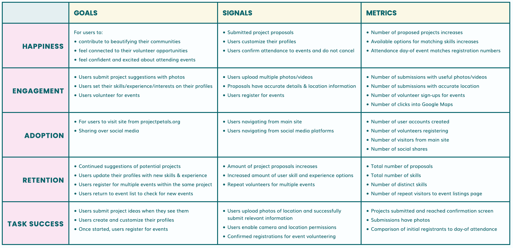
KPIs - Google Heart Framework
Once the site is launched, there will be five different areas in which success can be measured. The chart below explains what each of these categories are and how we can know if those areas are doing as well as they should.
Next Steps
We handed the results of our research and final designs back to Alicia White, to send to developers to build. We included our final clickable prototypes, design assets, a comprehensive style guide, and a copy of our final research findings.
We focused on the volunteer's side of the portal, and the next step is to build the back-end and options for the administrators. The admin view would include ability to: View submitted projects, Add details to projects, View volunteer preferences, and contact volunteers.
Thank you to the UX team of Adi Fine, Preston Tang and Zevy Blokh!