
Project Overview
Our team started this project after discussing the challenges that the year 2020 has brought to mental health. Noticing that we have experienced increased stress levels and also seen an increase in services reaching out to help with mental health, we started with a hypothesis that COVID-19 has increased both the demand and availability of mental health services.
We discussed the available options for mental health care — in-person therapy, virtual therapy, 1-on-1 or in groups, apps for meditation, diet, exercise — and how it can be overwhelming finding the mental health service that is best for you. Our goal is to build a website that matches people with the right mental health service for them, helping to guide them through the process and filter through the available options.
Scope of Work
Our problem space focused on the accessibility and availability of mental health services. We wanted our site to be affordable and accessible, to meet the varied needs of users who might be seeking out help with mental health.
Methods employed
・ To get more information about the needs of potential users, we created a screener survey and conducted user interviews
・ converted observations from interviews into insights with affinity mapping
・ synthesized insights into a persona and journey map
・ met with developers and created a MoSCoW Map and Feature Prioritization Matrix
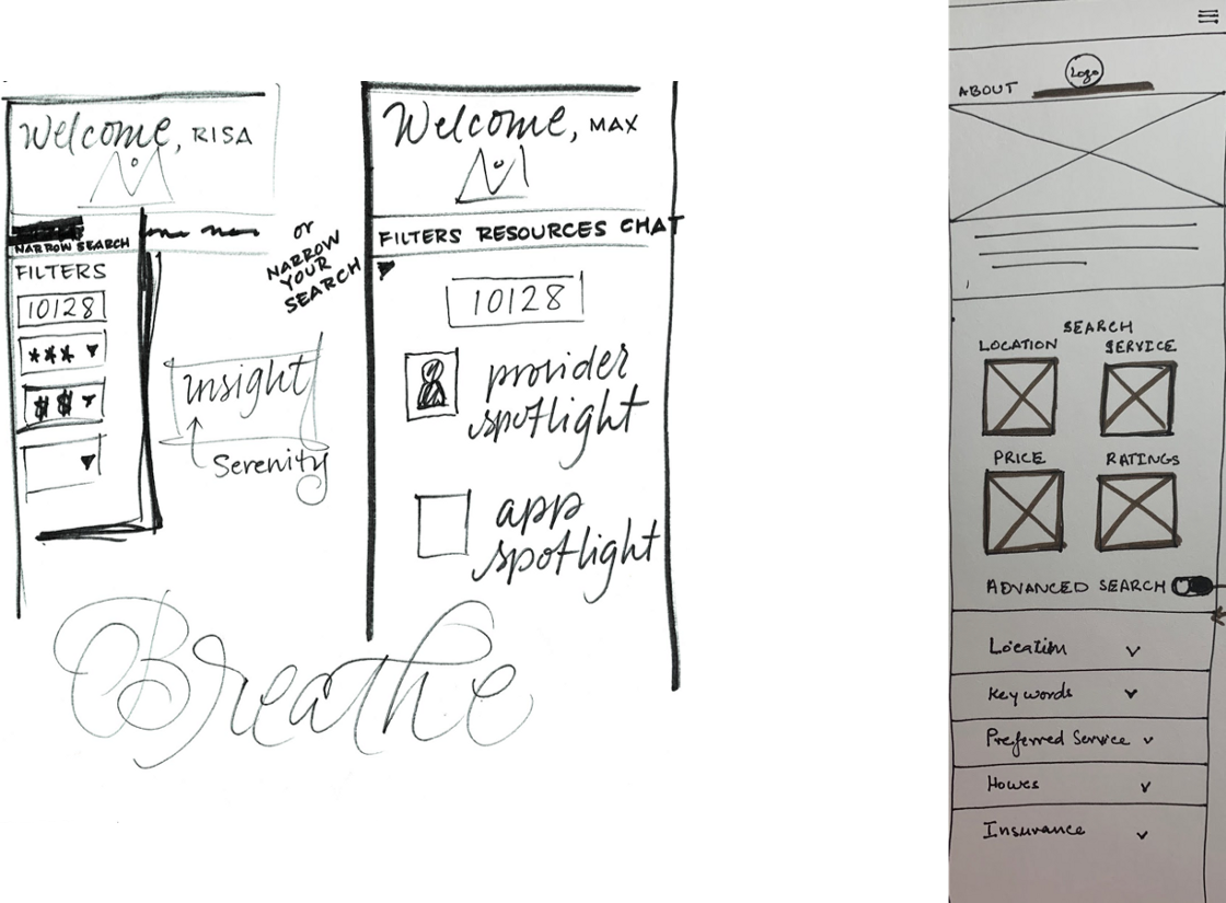
・ ran a design studio and created low-fidelity sketches that kicked off our design iterations into mid-fidelity and high-fidelity prototypes
・ converted observations from interviews into insights with affinity mapping
・ synthesized insights into a persona and journey map
・ met with developers and created a MoSCoW Map and Feature Prioritization Matrix
・ ran a design studio and created low-fidelity sketches that kicked off our design iterations into mid-fidelity and high-fidelity prototypes
Problem Space
Initial Problem Statement
・ People have different mental health needs, and COVID-19 has caused stress and disrupted lives.
・ As a result, people who are seeking out mental health services are faced with a large amount of different services, features and treatment options.
・ How might we help people find the service that matches their needs best?
・ As a result, people who are seeking out mental health services are faced with a large amount of different services, features and treatment options.
・ How might we help people find the service that matches their needs best?
RESEARCH PHASE (Discover + Define)
Our goal for initial research was to identify pain-points for users in mental health and wellness apps and services. We wanted to gather details on barriers to finding and using mental health services, and focus in on the problem areas to improve.
Methodology
To get more information about the needs of potential users, we set out to perform user interviews, with a screener survey. The survey results allowed us to choose a representative sample of potential users, across a broad range of demographics and experiences, and their answers prepared us with relevant questions for our discussion guide during the interviews. With recognition of the sensitivity of the topic, we wanted to be sure to note to interviewees that we do not need to discuss their own mental health, only their experiences and opinions on services.
Synthesis » Affinity Mapping
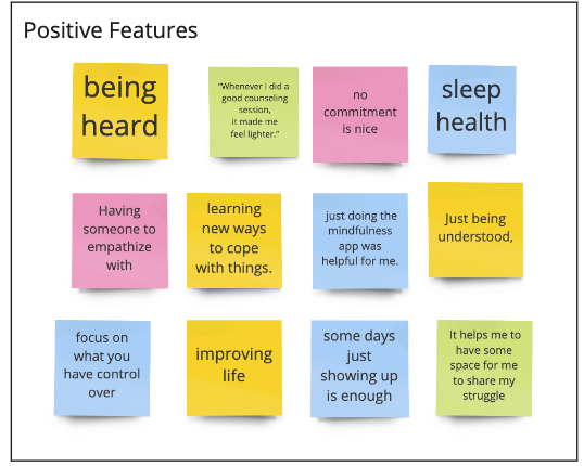
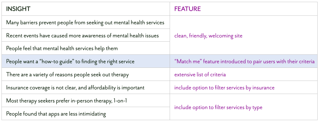
Our goal for the affinity map was to record our observations and sort them into common themes. From this, we were able to form “I” statements and insights, to make our persona come to life.
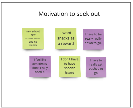
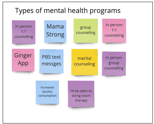
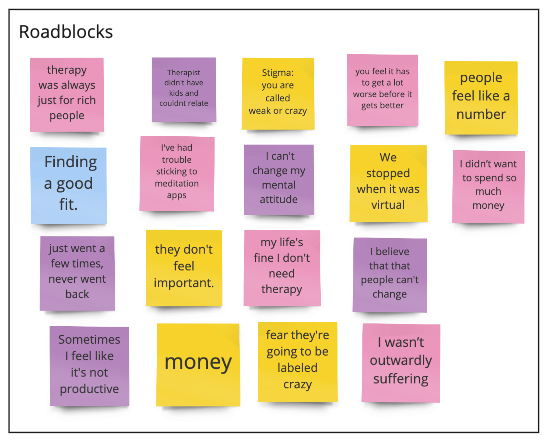
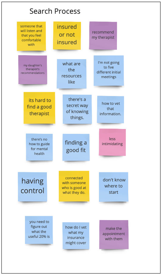
・ We identified 7 main themes from our interview observations.
・ The largest ones centered around the search process and roadblocks in finding care (18 observations in each)
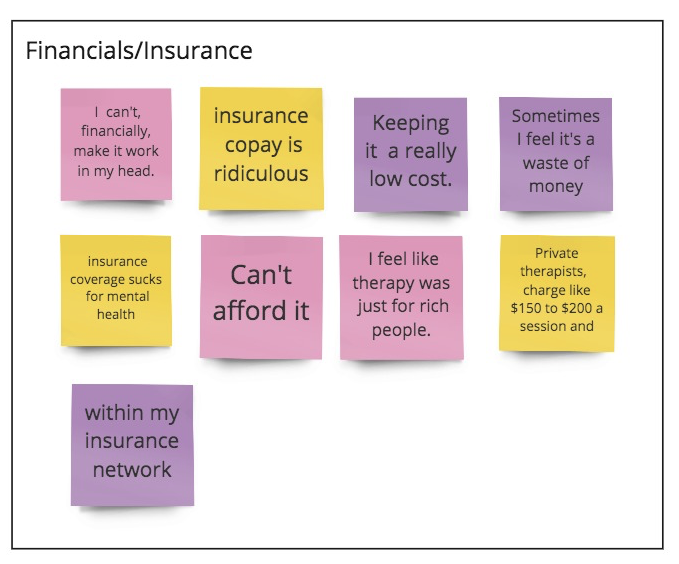
・ The financials are obviously very confusing. For example: insurance coverage vs. private payment
・ While subjects preferred 1-on-1 in-person therapy overall, a wide variety of options was mentioned
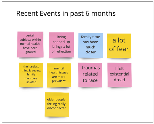
・ Recent events have increased need and awareness of mental health services
・ All subjects acknowledged a change in mental health issues the past 6 months
・ The largest ones centered around the search process and roadblocks in finding care (18 observations in each)
・ The financials are obviously very confusing. For example: insurance coverage vs. private payment
・ While subjects preferred 1-on-1 in-person therapy overall, a wide variety of options was mentioned
・ Recent events have increased need and awareness of mental health services
・ All subjects acknowledged a change in mental health issues the past 6 months
Themes, “I” Statements and Insights
The most significant insight we found is that people want a “how-to guide” to finding the right mental health service for them, but feel that this guide does not exist.

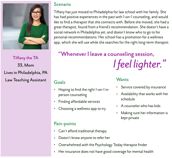
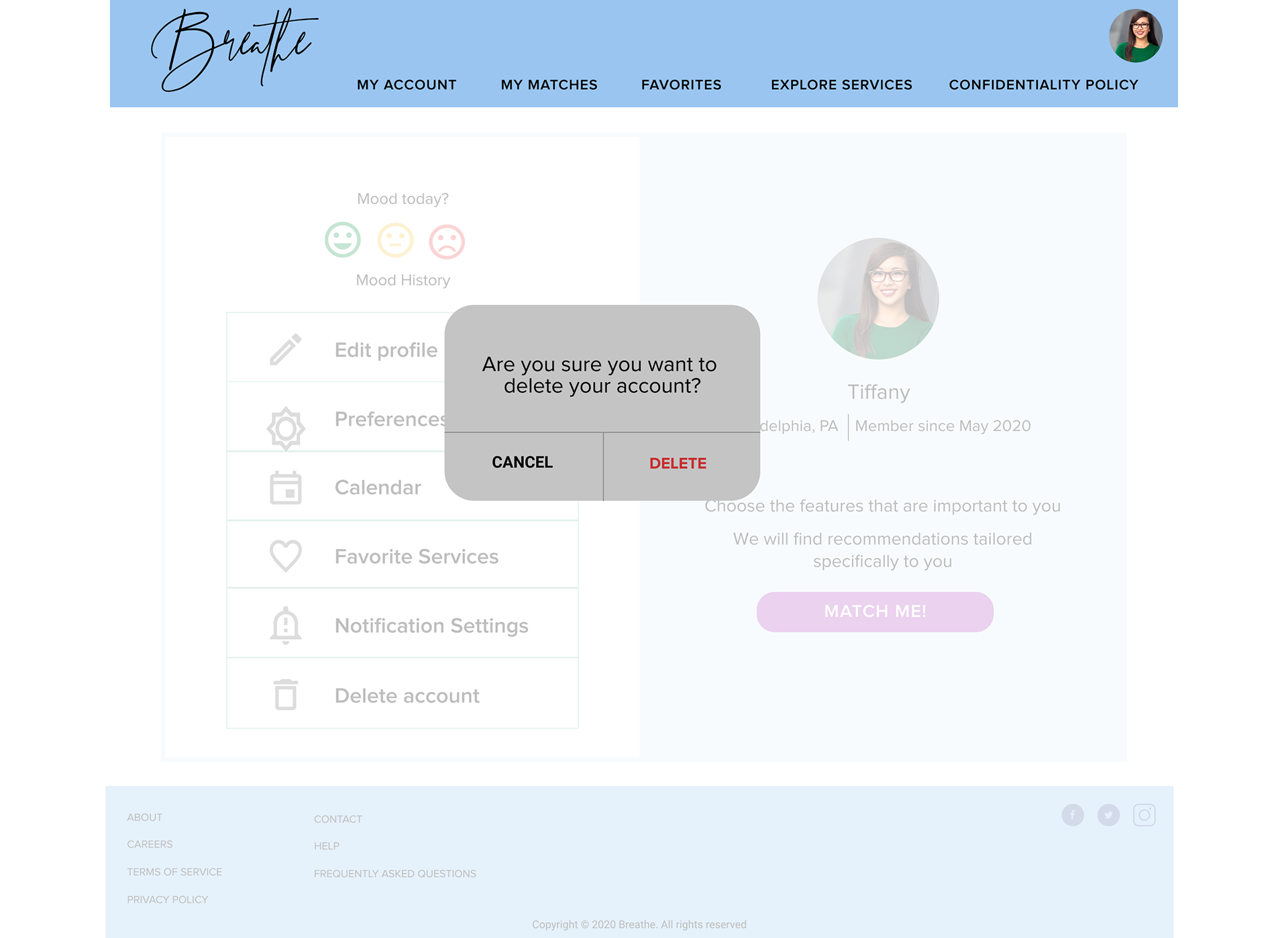
Persona
Our persona is a mix of all our interview subjects, distilling the main themes, goals, wants and pain-points into one archetype of a user.
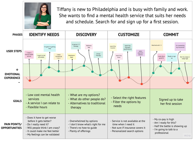
Journey Map
The journey map provides a visual representation of Tiffany’s emotions before during and after the given scenario.
This allows us to examine pain-points and highlights any feature gaps in the design so far.
This allows us to examine pain-points and highlights any feature gaps in the design so far.
Insights & Takeaways
・ Tiffany mostly felt positive during her user journey map.
・ The discovery phase was the most positive, and she did not fall in the negative emotional experience zone during that phase. During this phase she experiences optimism.
・ A big low point is when she had to look at payment options. This reflects our findings from interviews about pain-points.
・ Aside from financial concerns, she felt anxious at some points in her journey.
Revised Problem Statement
・ People have different mental health needs, and current events have caused stress and disrupted lives.
・ As a result, Tiffany is seeking out mental health services. She is faced with a large amount of different services, features, and treatment options, making finding the right fit challenging.
・ How might we help Tiffany find the service that matches her needs best?
・ As a result, Tiffany is seeking out mental health services. She is faced with a large amount of different services, features, and treatment options, making finding the right fit challenging.
・ How might we help Tiffany find the service that matches her needs best?
RESEARCH » DESIGN
DESIGN PHASE
Design Studio
We conducted a Design Studio with developers to focus in on our MVP, and what essential features we needed to have in our site.
Insights & Takeaways
・ Focused our design ideas and cleared up our main objectives
・ Helpful to have different minds and viewpoints
・ Gave us insight on the work needed from an software engineering perspective
・ Guided us to a blocked out screen layout
・ Helpful to have different minds and viewpoints
・ Gave us insight on the work needed from an software engineering perspective
・ Guided us to a blocked out screen layout
Mid-fidelity Wireframes
We created mid-fidelity wireframes to test the site’s clarity, ease of use, and natural user flow
・ Our wireframes act as a sandbox/playground for ideas
・ We kept our persona’s goal in mind while designing wireframes
・ We focused on our three tasks
・ These wireframes are not yet high-fidelity, and are are part of the MVP process
・ Our wireframes act as a sandbox/playground for ideas
・ We kept our persona’s goal in mind while designing wireframes
・ We focused on our three tasks
・ These wireframes are not yet high-fidelity, and are are part of the MVP process
Insights & Takeaways
・ Creating our mid-fi wireframes directly followed low-fi sketches from design studio
・ Creating mid-fidelity wireframes allows up to consider future build-outs without full commitment
・ By creating mid-fi wireframes we were able to focus on the purpose of the site, and our persona’s goals
・ These wireframes connect everything together: goals, tasks, purpose
・ Creating mid-fidelity wireframes allows up to consider future build-outs without full commitment
・ By creating mid-fi wireframes we were able to focus on the purpose of the site, and our persona’s goals
・ These wireframes connect everything together: goals, tasks, purpose
Initial Usability Testing: First Round
Discussion Guide
・ We developed a discussion guide for in-person usability testing
This included an introduction to our mobile site, brief explanation of the mid-fidelity prototype, our goals for testing, and a brief summary of our motivations in developing this site
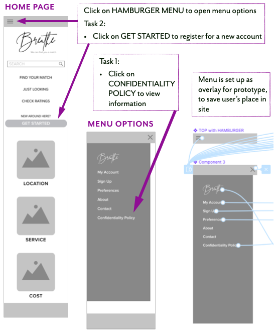
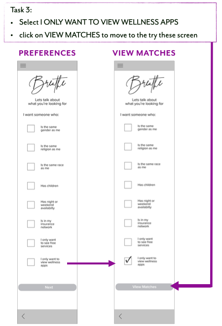
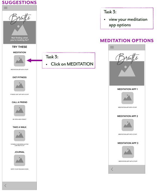
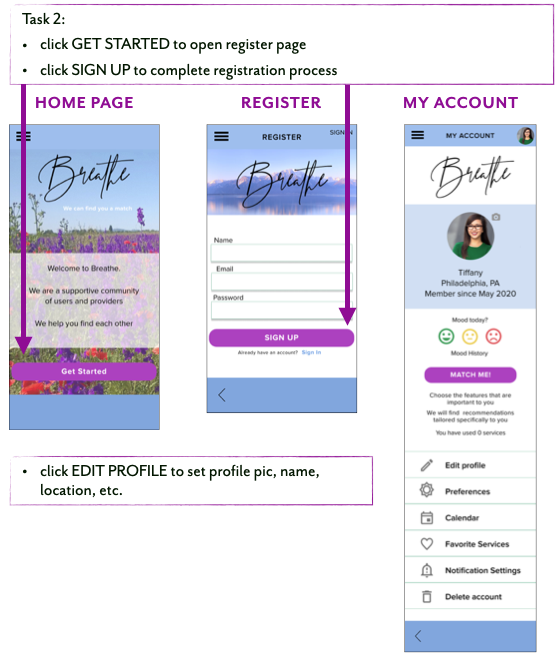
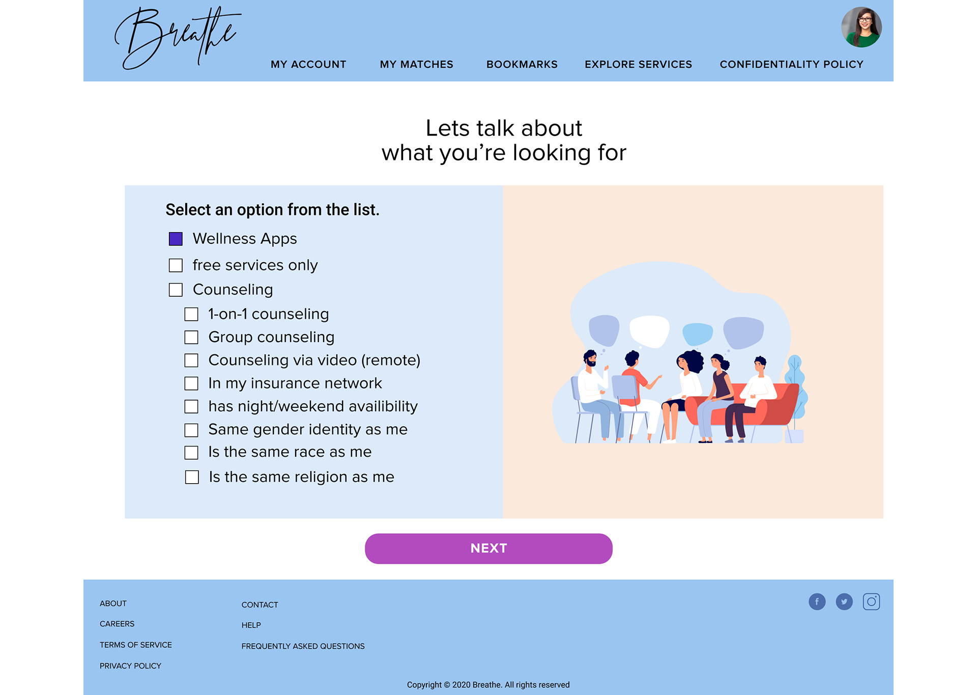
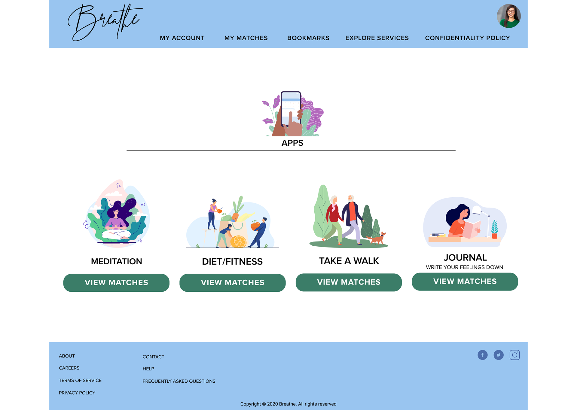
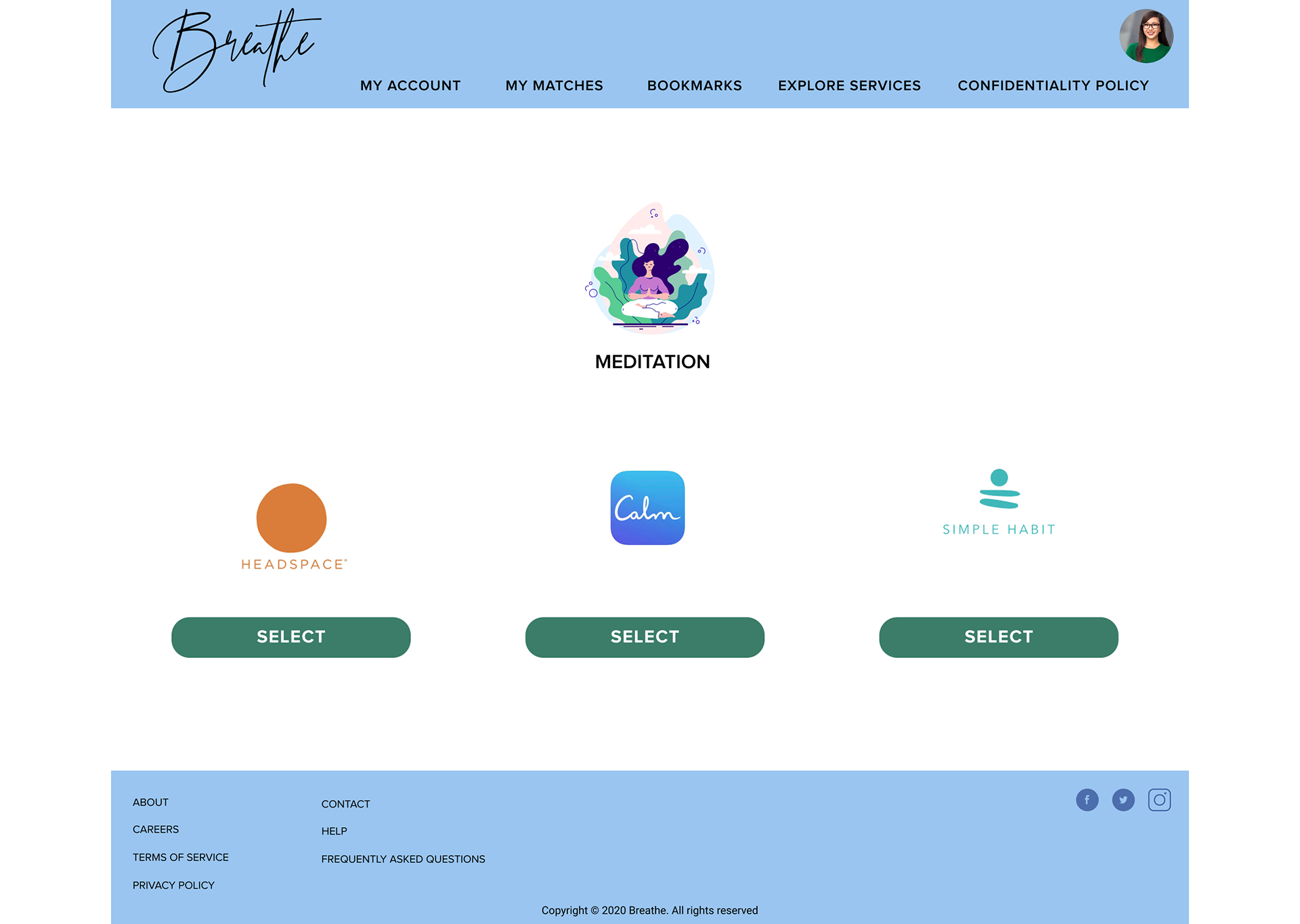
・ We composed three tasks:
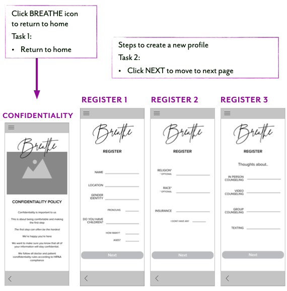
1. Find Breathe’s policies regarding privacy
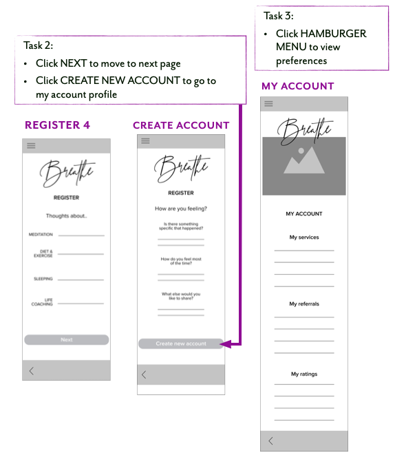
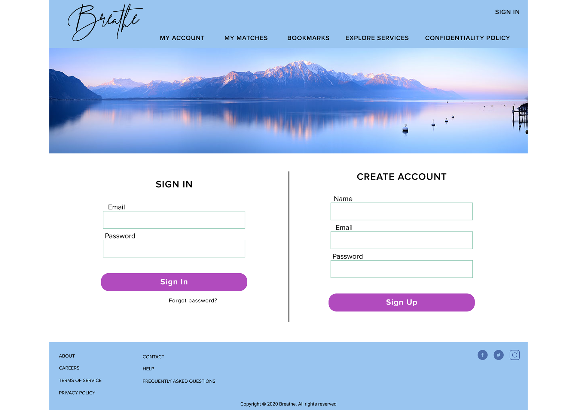
2. Sign up for a new Breathe account
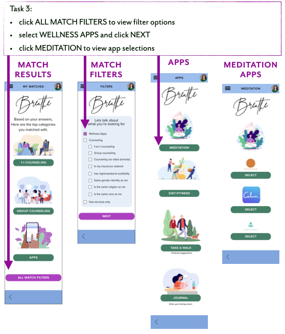
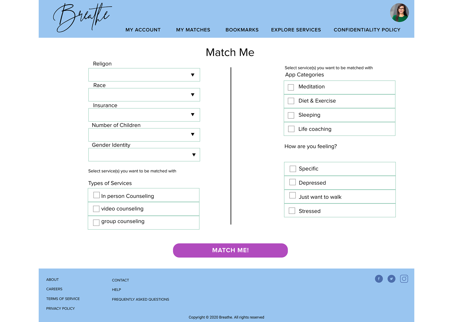
3. Narrow results to view only apps, then select programs that focus on reflection, breathing, deep-thoughts
・ We took our mid-fidelity wireframes and created clickable prototypes for usability testing.
・ We composed 3 tasks for testing, all with our persona in mind.
・ We were looking to get data about success rates and easiness of our prototype.
・ We developed a discussion guide for in-person usability testing
This included an introduction to our mobile site, brief explanation of the mid-fidelity prototype, our goals for testing, and a brief summary of our motivations in developing this site
・ We composed three tasks:
1. Find Breathe’s policies regarding privacy
2. Sign up for a new Breathe account
3. Narrow results to view only apps, then select programs that focus on reflection, breathing, deep-thoughts
・ We took our mid-fidelity wireframes and created clickable prototypes for usability testing.
・ We composed 3 tasks for testing, all with our persona in mind.
・ We were looking to get data about success rates and easiness of our prototype.
Insights & Takeaways
・ Hamburger menu was hard to find for some testers
・ Some words used in the app were difficult to describe without “word-searching”
・ This affected the success rate for some users, particularly on the third task
・ Some users showed confusion about whether they had returned to home page
・ We noticed users checking and clicking on home page more than hamburger menu
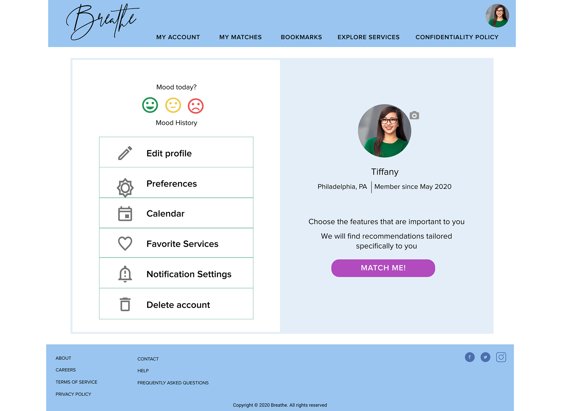
・ Some users looked for preferences by going to “My Account” first
・ Users were inclined to click on text fields on registration pages.
・ Users read through all the text on the registration pages. This led us to propose a new assumption: Users would prefer to have drop-down menus for settings, as opposed to typing in answers
・ Hamburger menu was hard to find for some testers
・ Some words used in the app were difficult to describe without “word-searching”
・ This affected the success rate for some users, particularly on the third task
・ Some users showed confusion about whether they had returned to home page
・ We noticed users checking and clicking on home page more than hamburger menu
・ Some users looked for preferences by going to “My Account” first
・ Users were inclined to click on text fields on registration pages.
・ Users read through all the text on the registration pages. This led us to propose a new assumption: Users would prefer to have drop-down menus for settings, as opposed to typing in answers
Design Iterations: First Round
We connected the wireframes to clickable navigation paths, adding animation to site page transitions.
The resulting prototype can be used for testing, to simulate live site.
Insights & Takeaways
・ Prototype allowed users to experience the feeling of the site
・ Users commented on calming, clean layout
・ Side menu shifted from a page to a component-overlay
・ Overlay allowed users current page to remain under the menu
・ After previewing prototype, we added back buttons
・ Back button contributed to indirect success rate
Usability Testing: Second Round
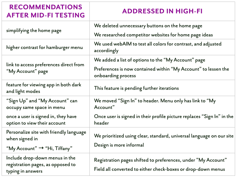
Recommendations after mid-fidelity testing
・ Simplify the home page
・ Consider higher contrast for hamburger menu
・ Add link to access preferences direct from “My Account” page
・ Add feature for viewing app in both dark and light modes
・ “Sign Up” and “My Account” can occupy same space in menu: once a user is signed in, they can view their account
・ Personalize site with friendly language when signed in: “My Account” changes to “Hi, Tiffany”
・ Include drop-down menus in the registration pages, as opposed to typing in answers
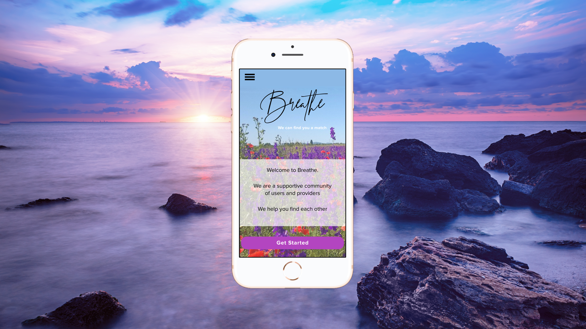
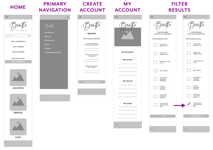
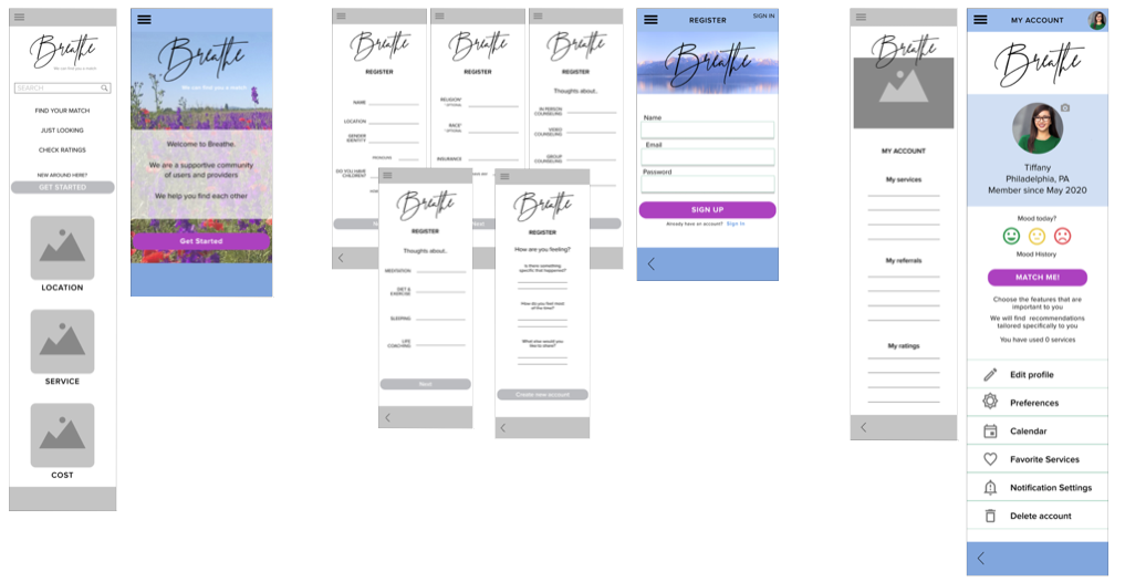
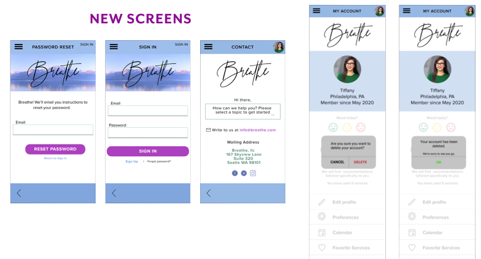
High-fidelity Mobile Screens
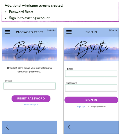
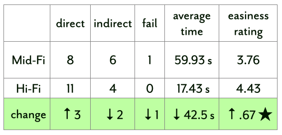
Comparisons, Mid-fi to Hi-fi and new screens added to Hi-fi
Usability Testing: Final Round
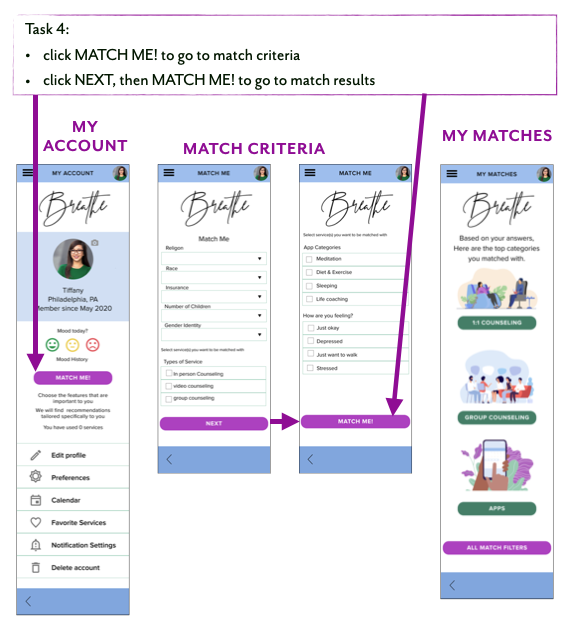
We added a new task for our high-fidelity testing: set preferences for getting matches. The new task highlighted the core purpose of our site.
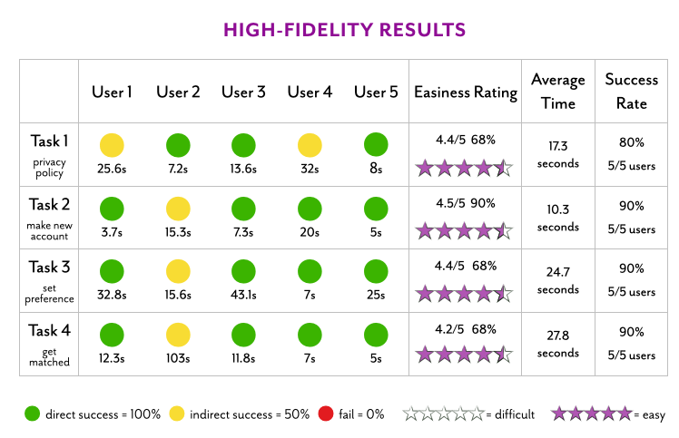
Insights & Takeaways
・ Several users commented that they did not realize when pages had scrollable content, if there was no cut-off image
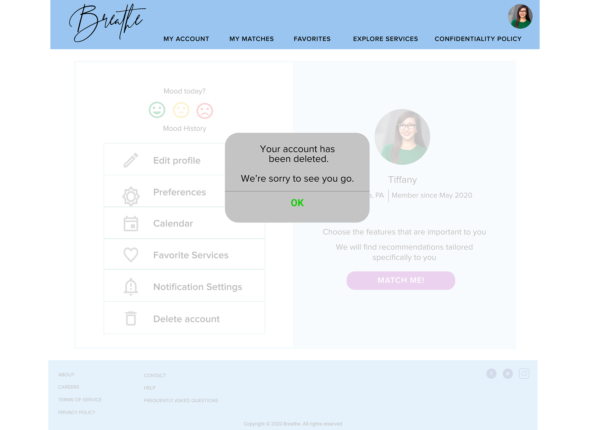
・ This came up specifically during task 4, on the “My Account” page
・ Success rate, time, and easiness rating improved in all categories in high-fidelity
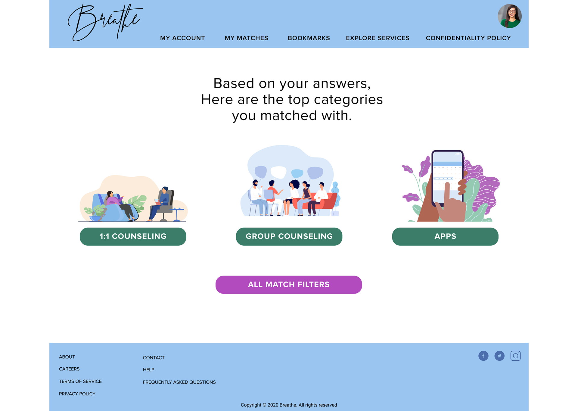
・ Further Research: more clarity between “My Matches”, “Match Me”, “Filters”, “Preferences” categories
・ Several users commented that they did not realize when pages had scrollable content, if there was no cut-off image
・ This came up specifically during task 4, on the “My Account” page
・ Success rate, time, and easiness rating improved in all categories in high-fidelity
・ Further Research: more clarity between “My Matches”, “Match Me”, “Filters”, “Preferences” categories
High-Fidelity Desktop Screens
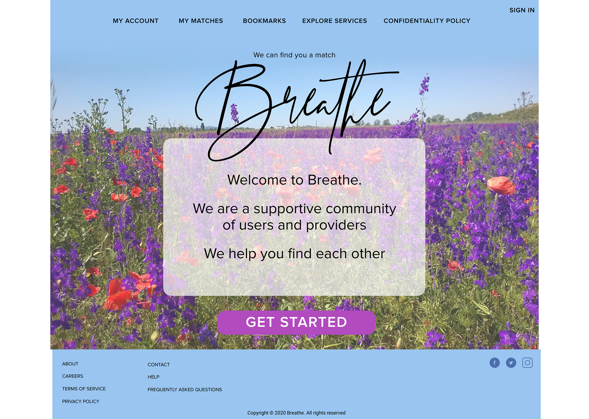
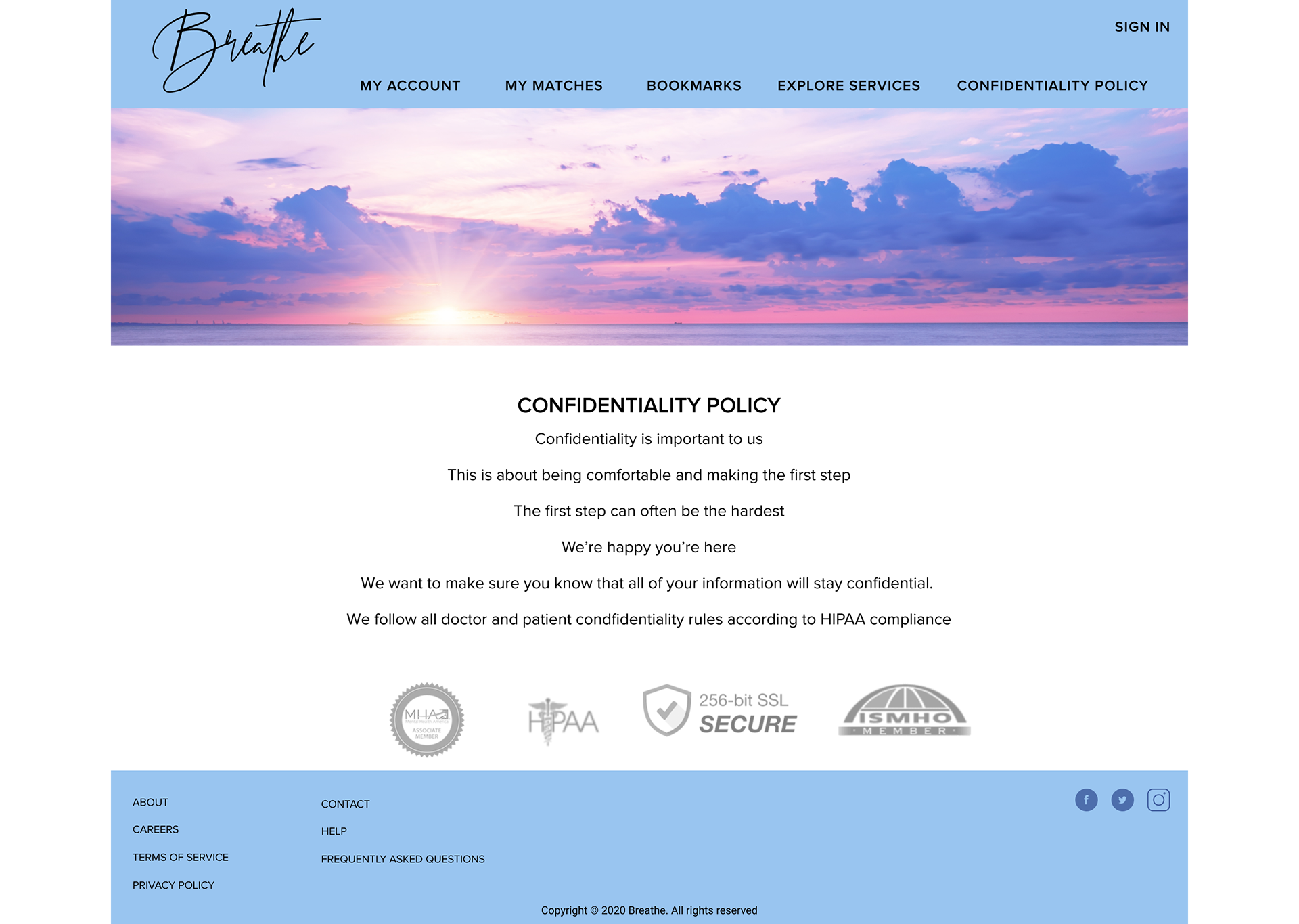
Final Prototypes
Mobile
Desktop
Next Steps
・ Clean up favorites, bookmarks
・ Refine language for “my matches”, “filter matches further”
・ Add content for apps and providers
・ Create onboarding for providers as well as users
・ Refine language for “my matches”, “filter matches further”
・ Add content for apps and providers
・ Create onboarding for providers as well as users